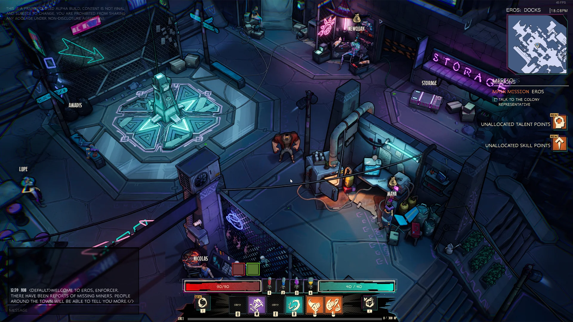
A multiplayer comic-book styled hack’n’slash ARPG.
This was my first professional project. I got onboarded near the end of pre-production. During development, I experienced a lot of collaboration with other developers and cemented myself in my UI/UX role.
Sadly, due to legal reasons the game is no longer available for purchase.
MAIN MENU
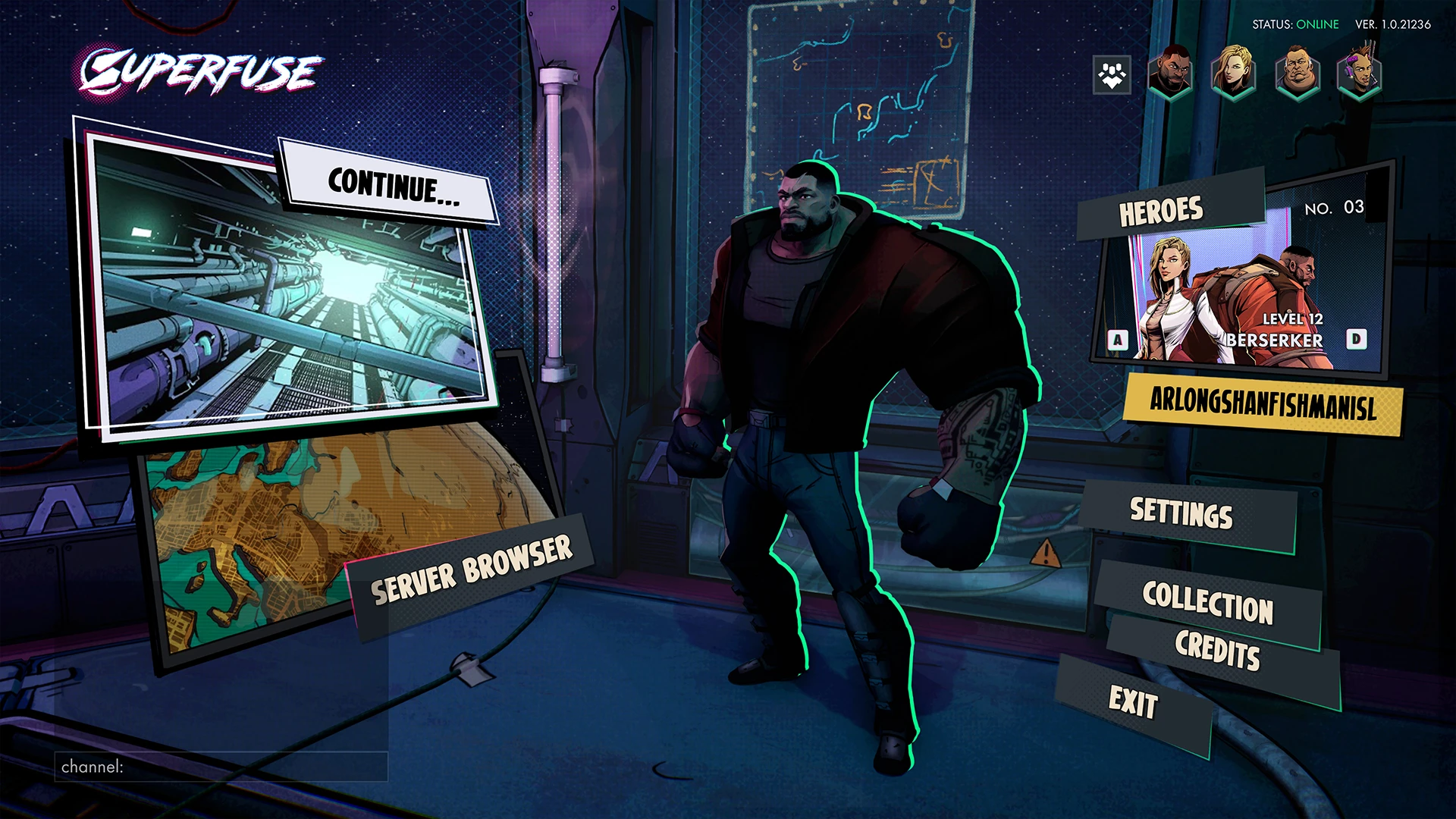
Main menu - Mockup
I wanted to push the theme of the game as this is one of the first screens the player will encounter. Showcasing these big comic book panels and dynamic buttons all pointing towards the player character.
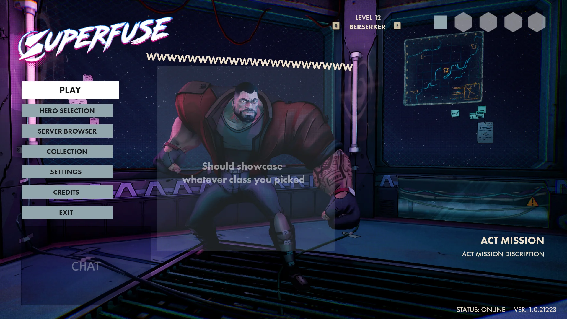
Login
Originally I wanted to go for something more simple and clean, adding all the options inside a list for also easy controller navigation.
Early exploration
An early mockup for the login. I wanted to keep it simple and have an area where players could see some information about the game. I am happy I decided to revisit this menu.
Finding the one
As explorations continued I slowly but surely came more to my final design. I became more creative and wanted to push the comic book feel forward. After experimenting with a panel vibe I really started to dive into it.
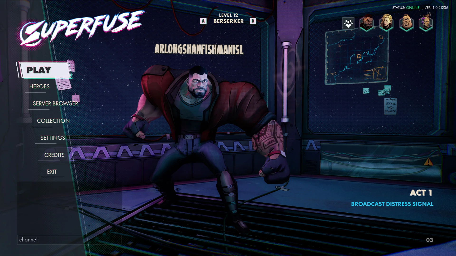
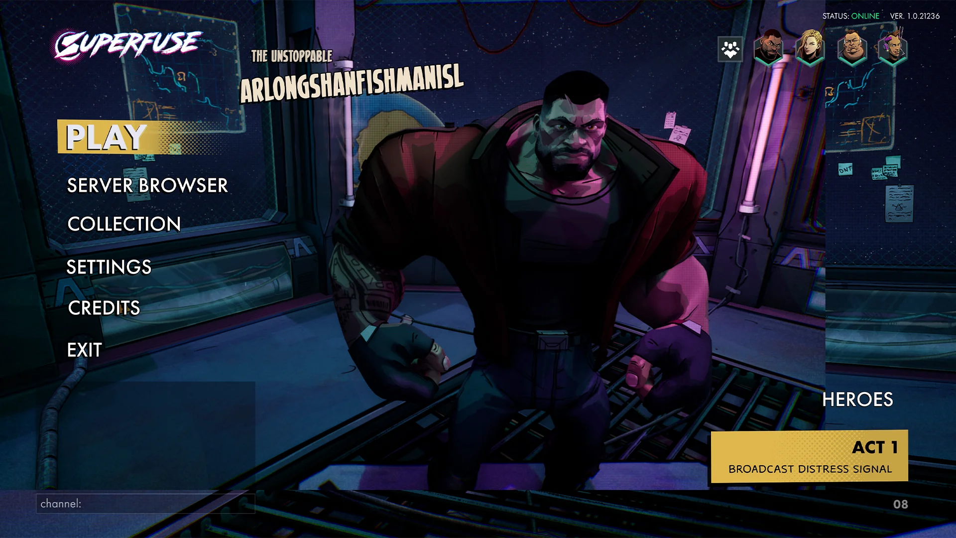
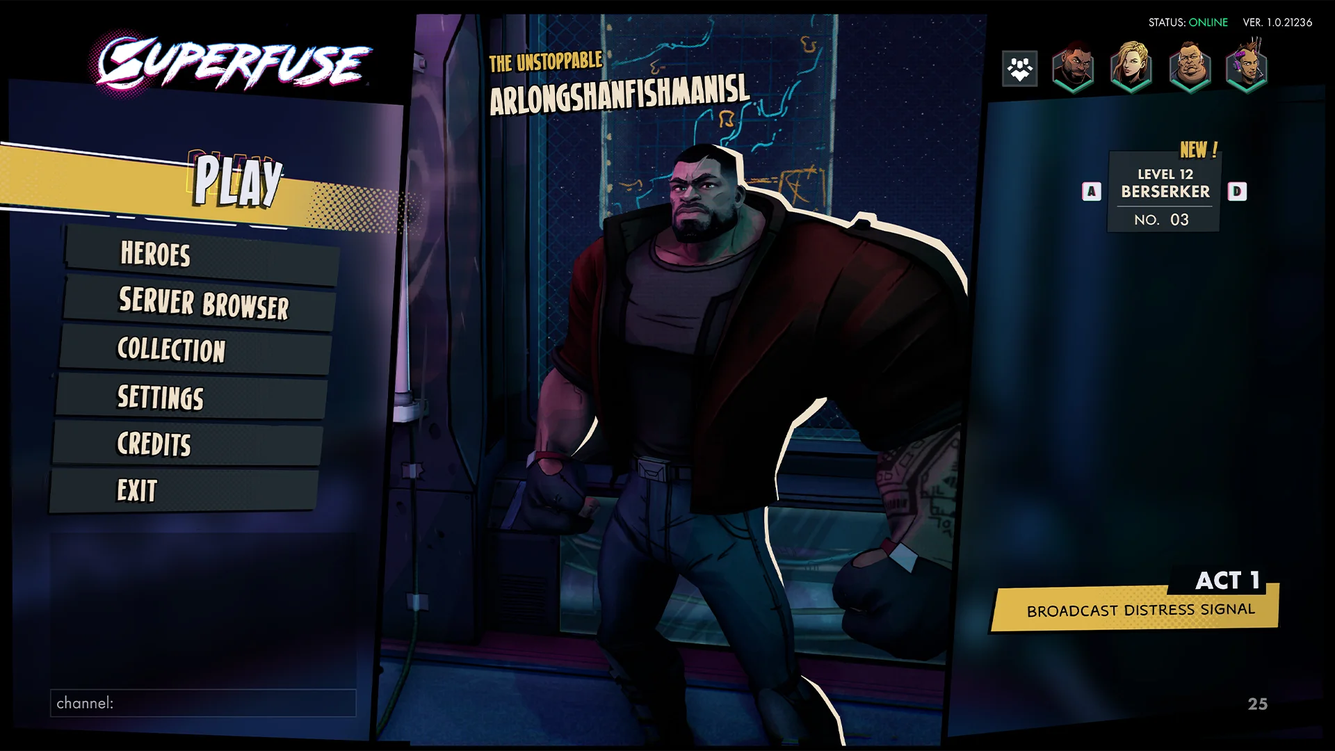
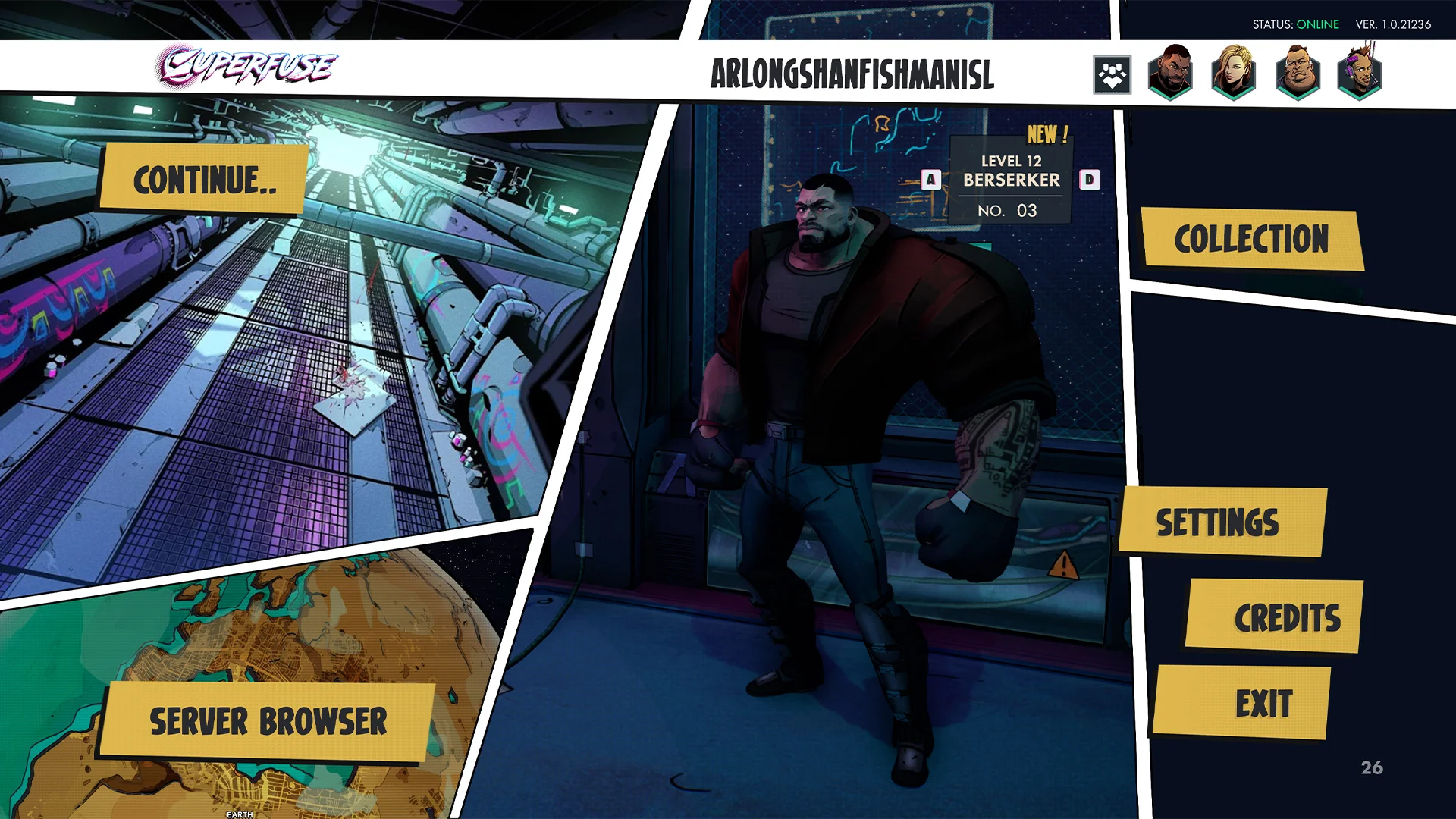
Main menu - In game
Integrating this menu was a ton of fun, working on the animations I wanted to give the feeling that the buttons came from the character. Due to time constraints we couldn’t get all the features like the quick swap of the character and the main menu party system.
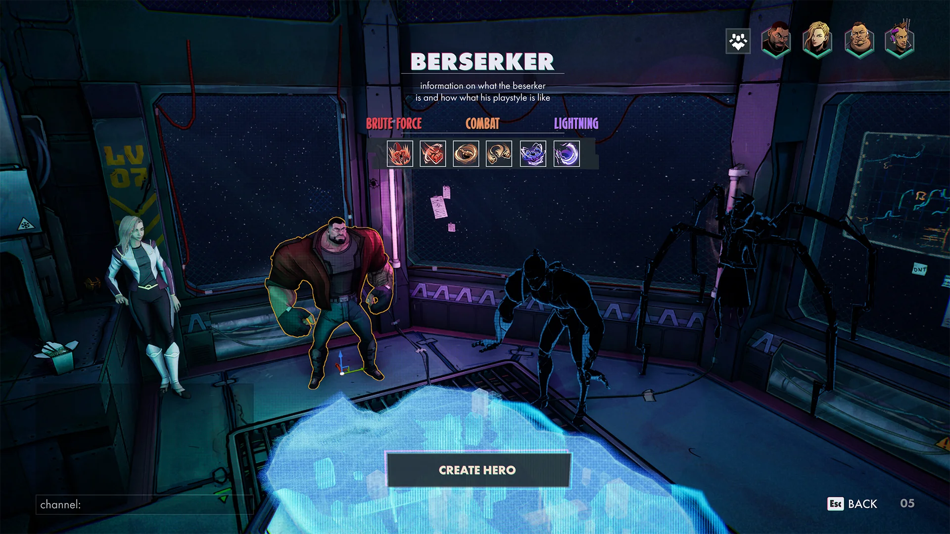
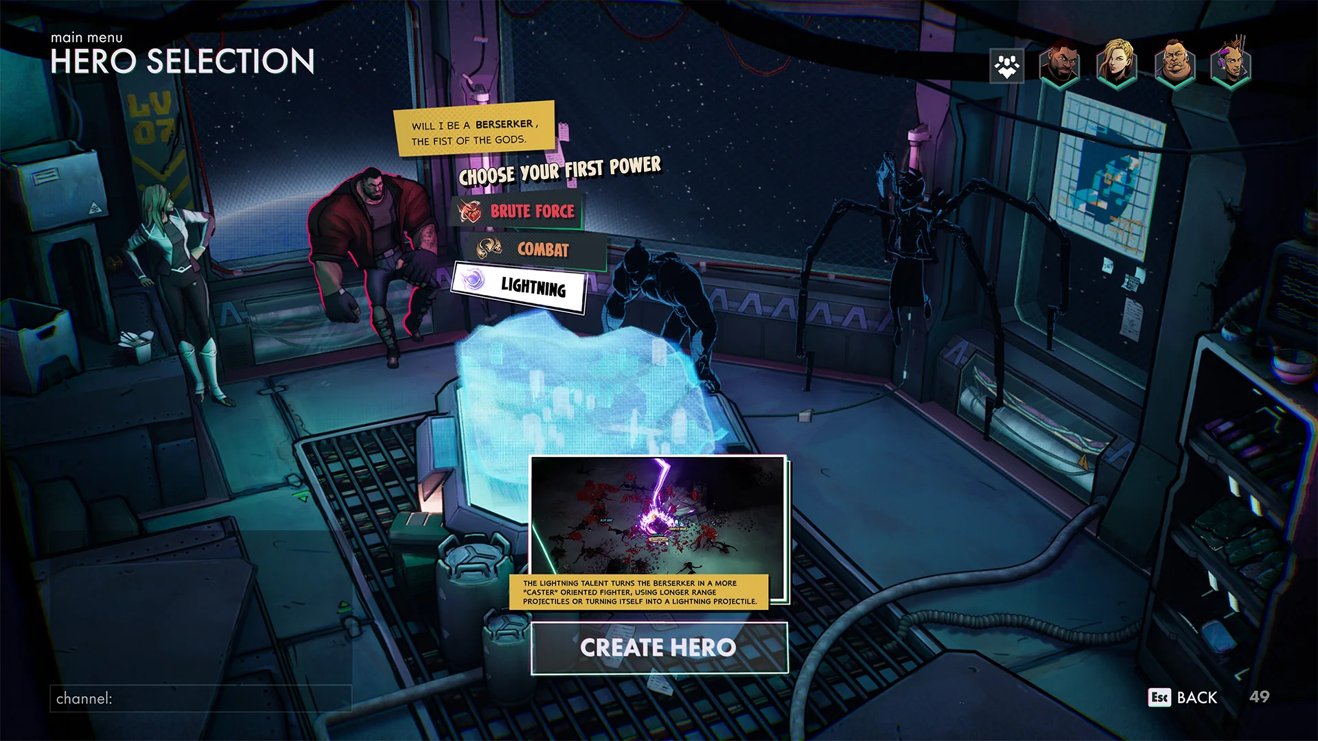
MAIN MENU - HERO SELECT
Hero select - In game
The process of this menu was quite difficult to get right. There were a lot of constraints and information that needed to be added.
Early exploration
There were a lot of constraints in this menu so the space I could use felt a bit limited.
Keep digging
After a few iterations I wanted to take a different direction, also trying to keep the comic book theme in mind. Using the resources available to me. the amazing art of our concept artist, David Thor Fjalarsson,
Link to his work!
Finding the one
I landed on some really cool designs but in the end there wasn’t time allocated to make this screen a reality. So I took a step back and tried something more fitting with the scope for this menu.
Main menu - In game
Integrating this menu was a ton of fun, working on the animations I wanted to give the feeling that the buttons came from the character. Due to time constraints we couldn’t get all the features like the quick swap of the character and the main menu party system.
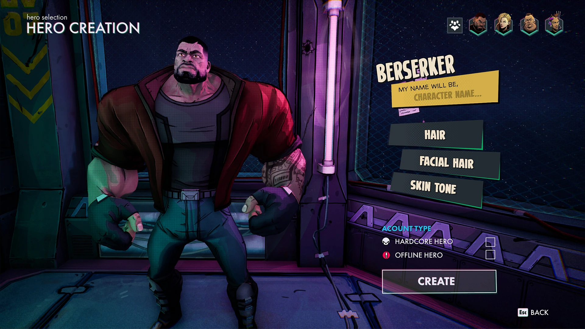
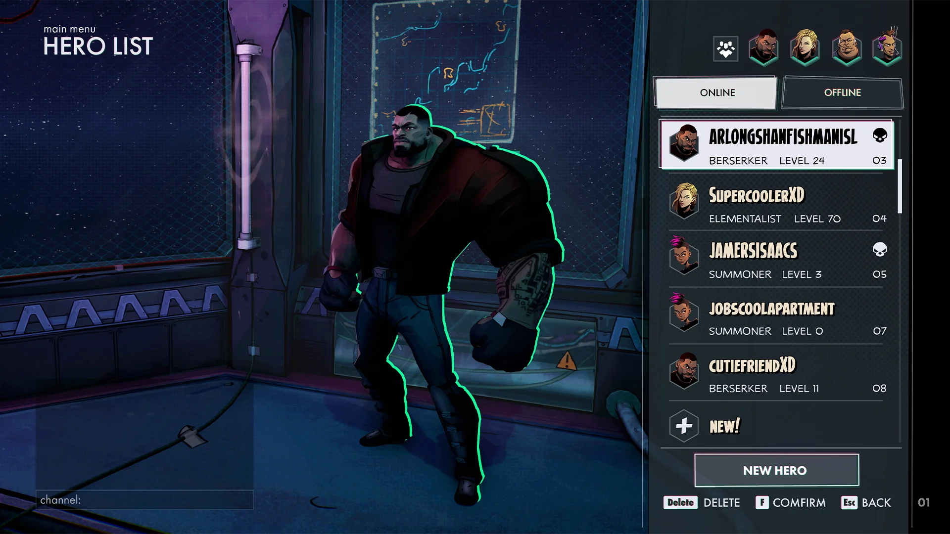
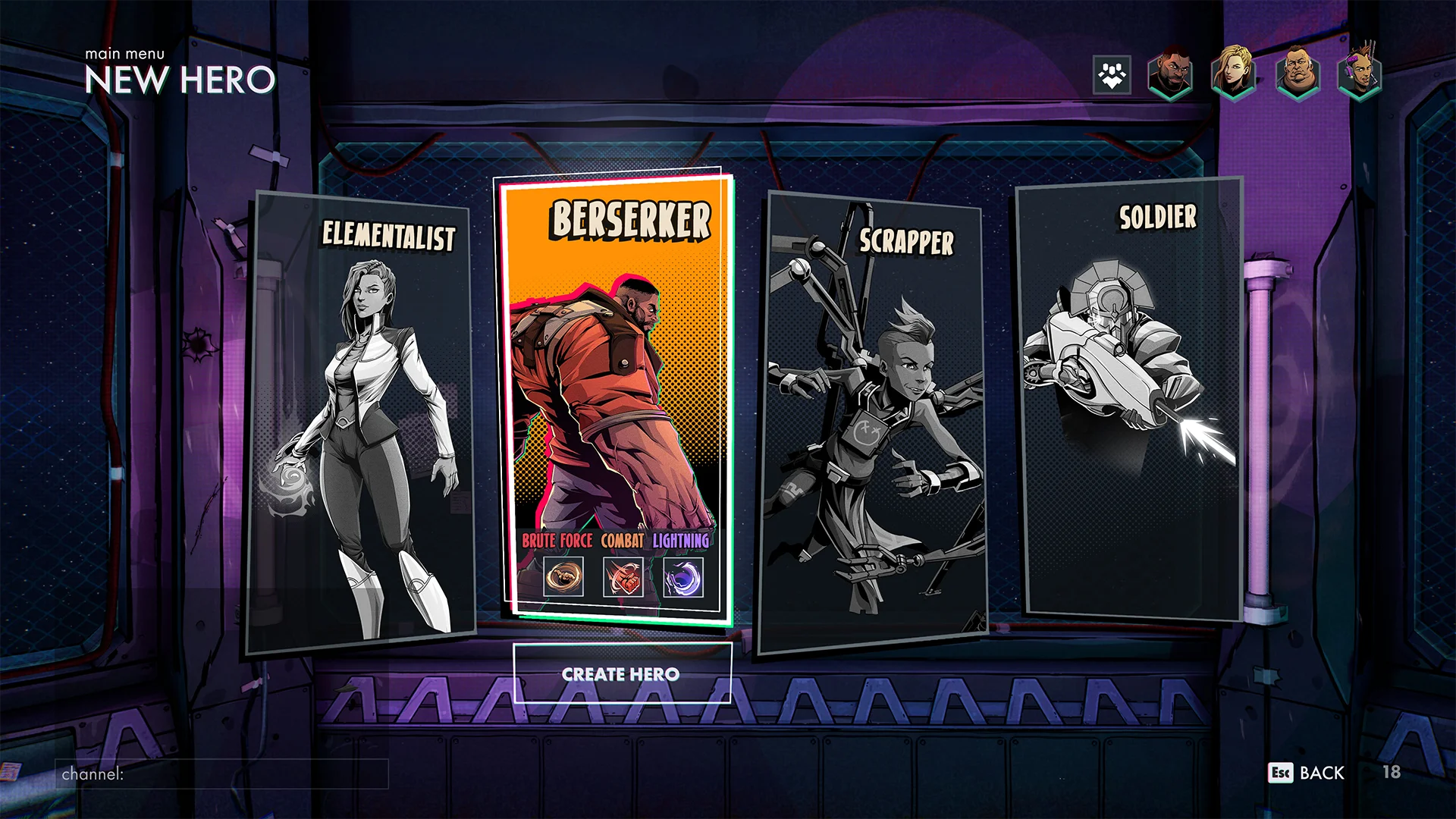
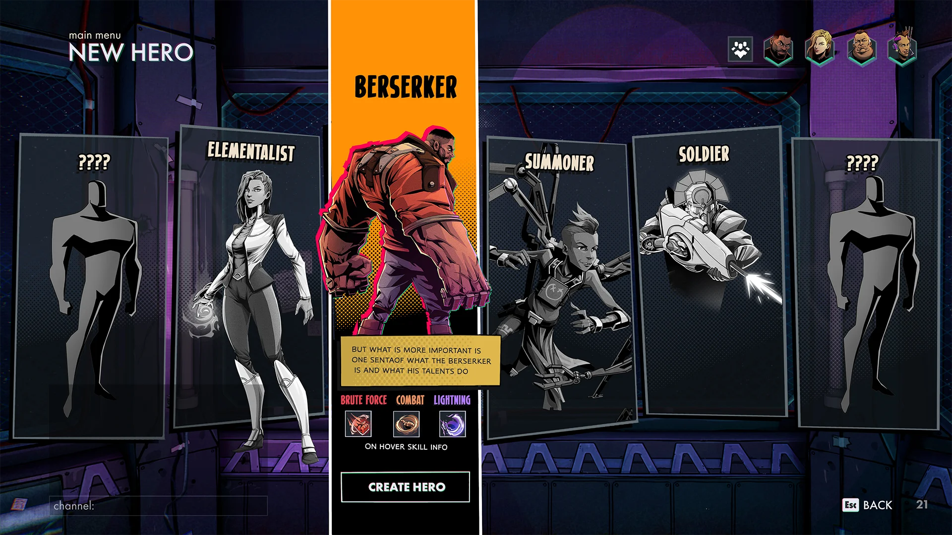
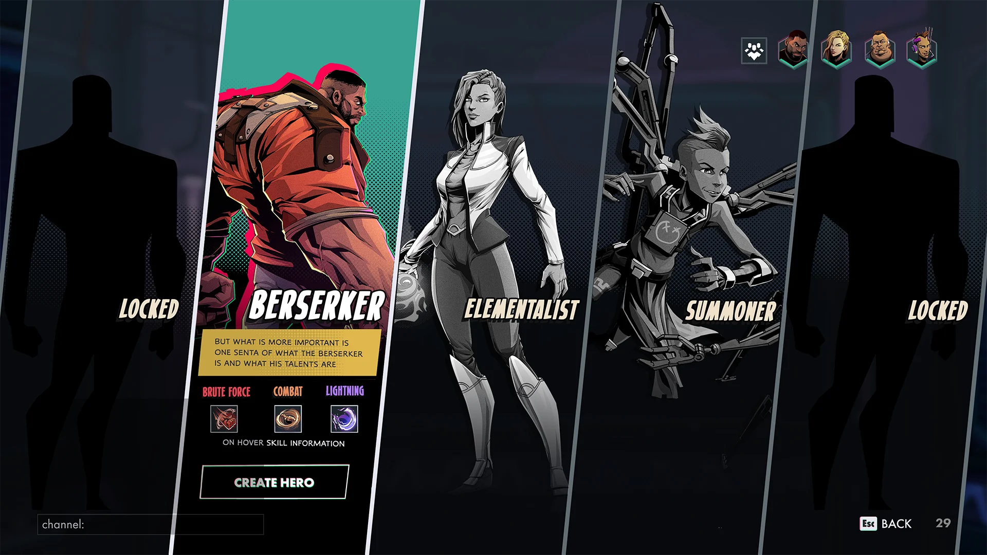
Hero creation and list
2 menus that are part of the main menu flow. The hero creation screen sadly doesn’t have the customization options that I added in the mockup due to time constraints.
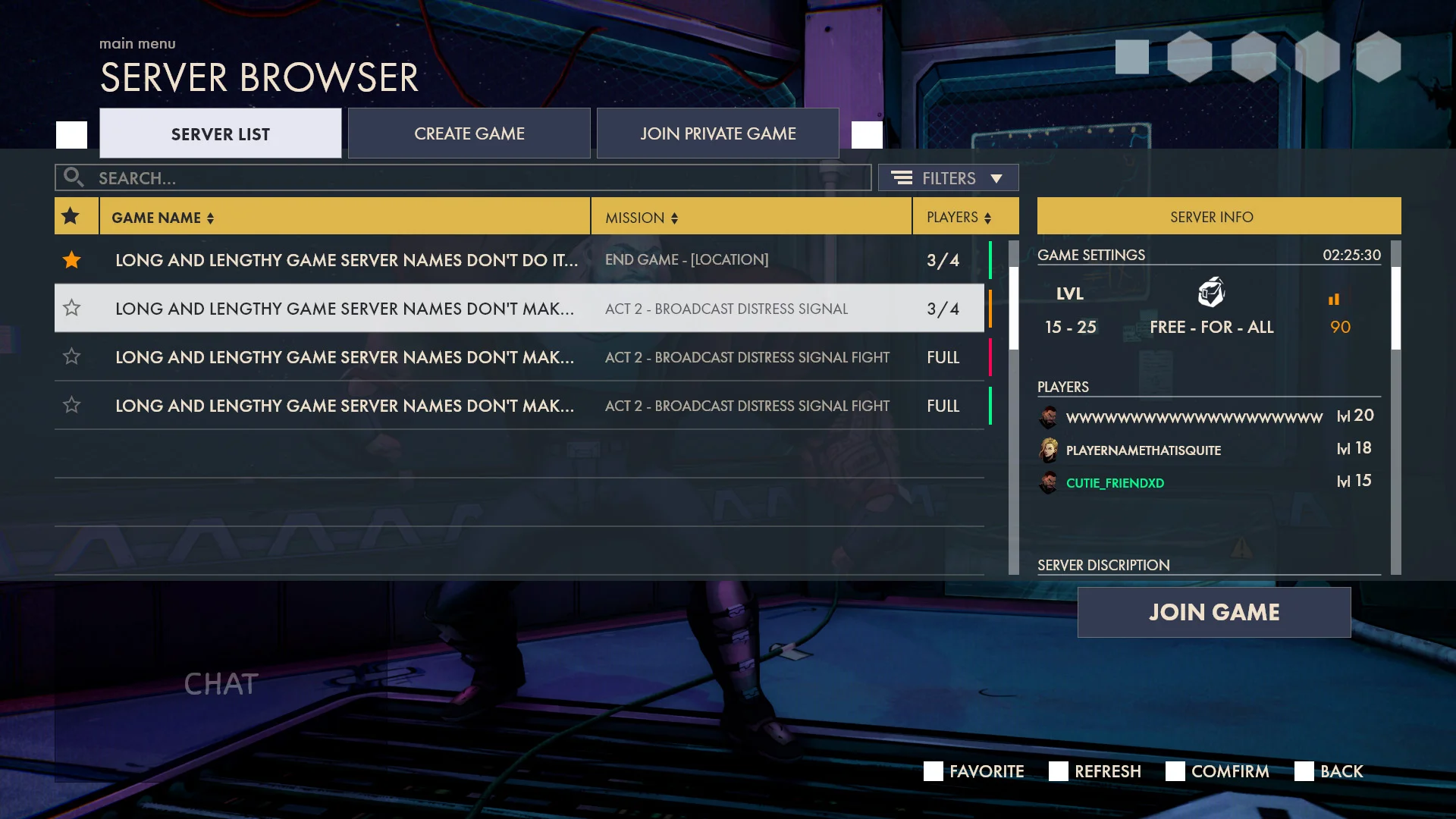
SERVER BROWSER
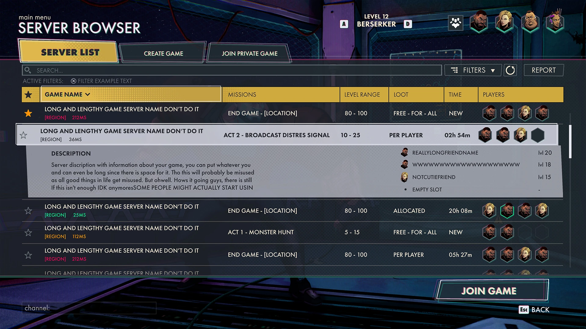
Server browser - mockup
I had to make room for a lot of extra tabs that I originally didn’t anticipate. This caused me to add the server info as a folding element to make better use of the space I have.
Classic UX
Creating the server browser UX was such an excellent menu to improve my UX skills, I constantly had to think about space and how long certain text is.
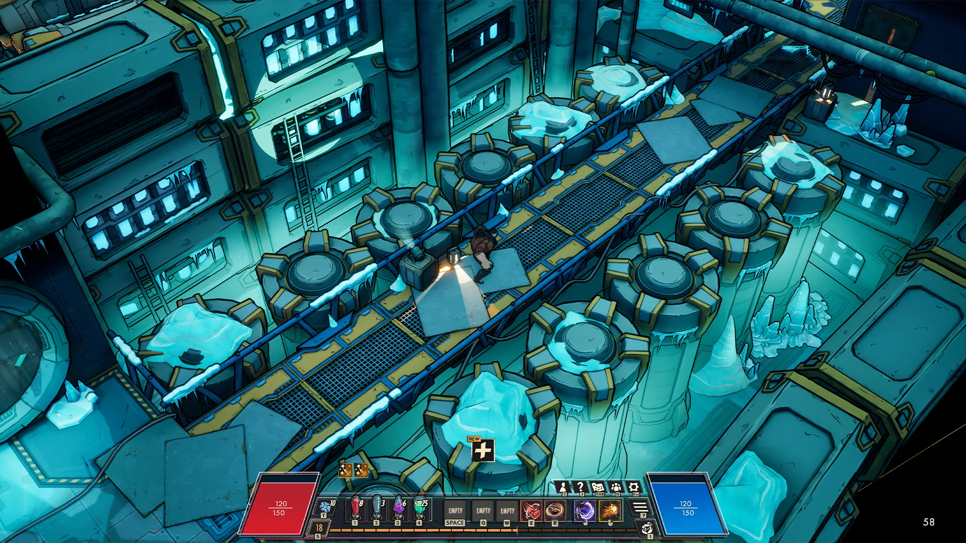
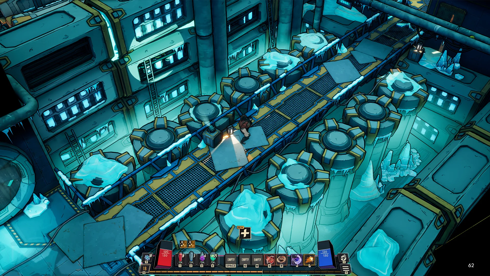
HUD - ACTION BAR
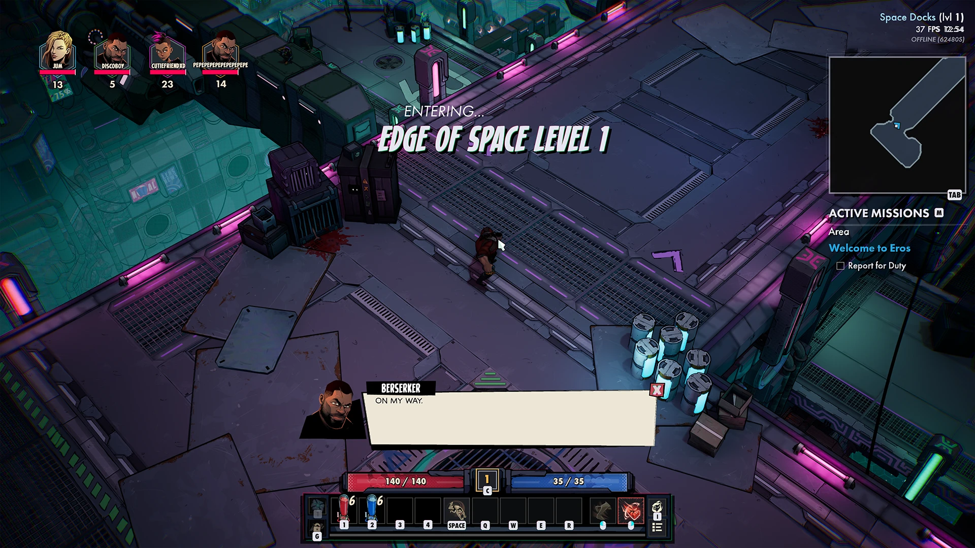
HUD Action bar - In game
One of the most challenging elements I had to design, I’ve done over 65 iterations on it. its an element that I redesigned twice during different stages of the project and I was almost never satisfied with it. There is so much you need to take into account.
First version
I wanted it to have the comic book feeling. Using the colors the game was currently using. Finding a good location for the 4 different boosters gave me a lot of design trouble.
Second version
During this stage of the project, we adapted a different UI style and I adapted it to the HUD. I’ve always made sure the Action bar wouldn’t overlap with the inventory.
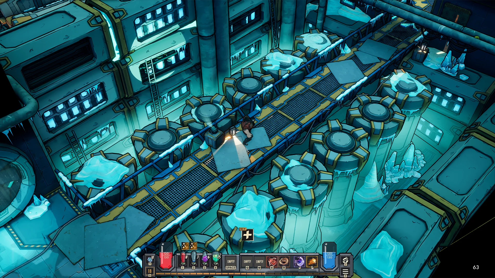
Third time is the charm
During the end stages of the project I did another pass. I went for something that is more grounded and rendered.
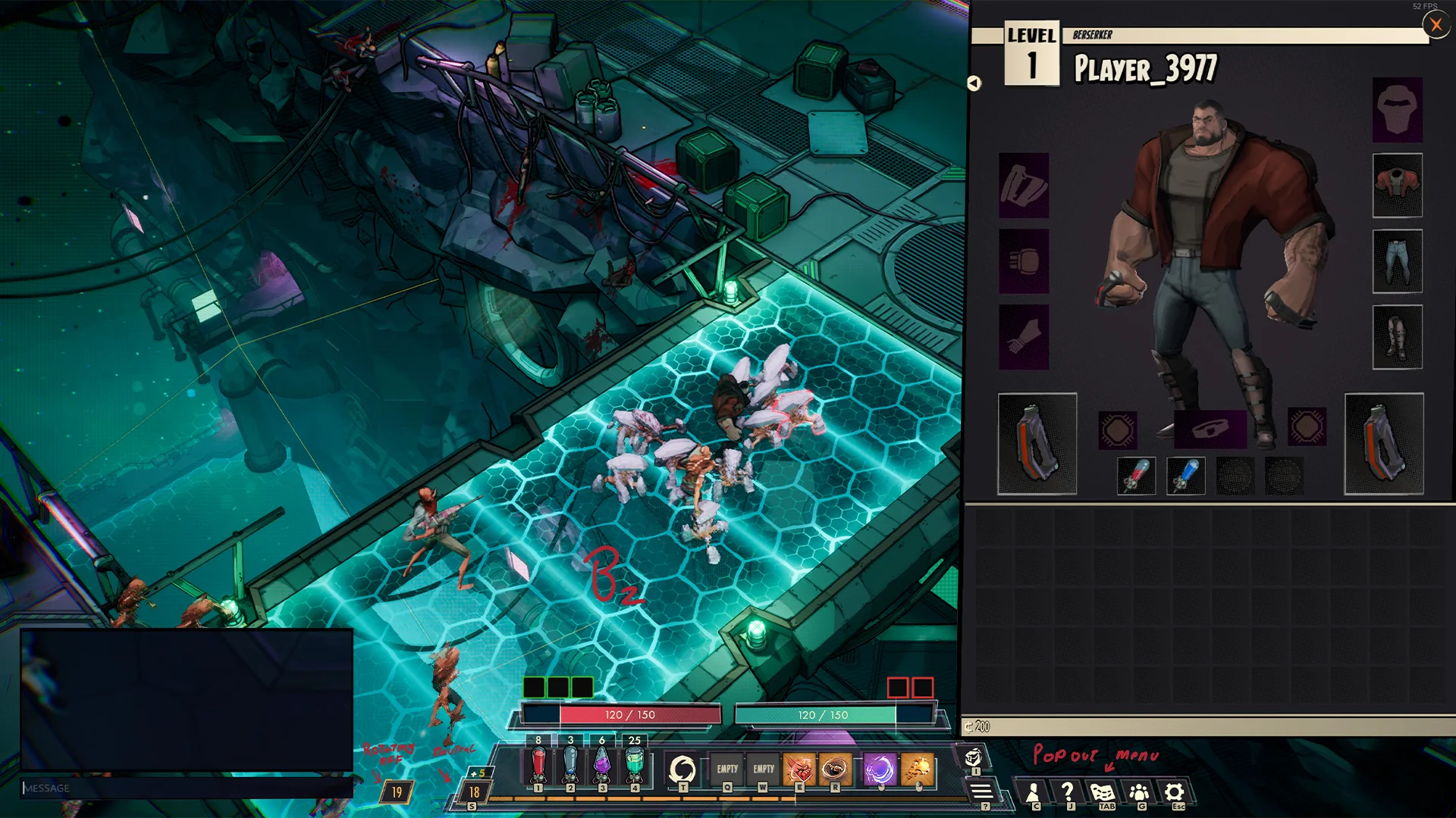
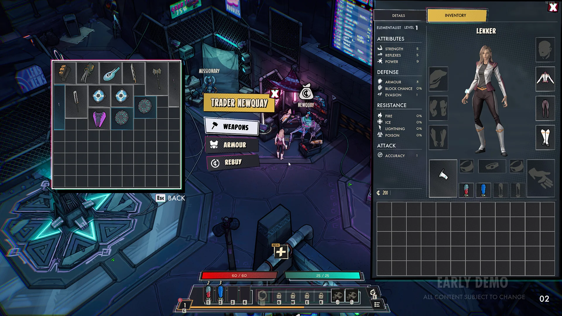
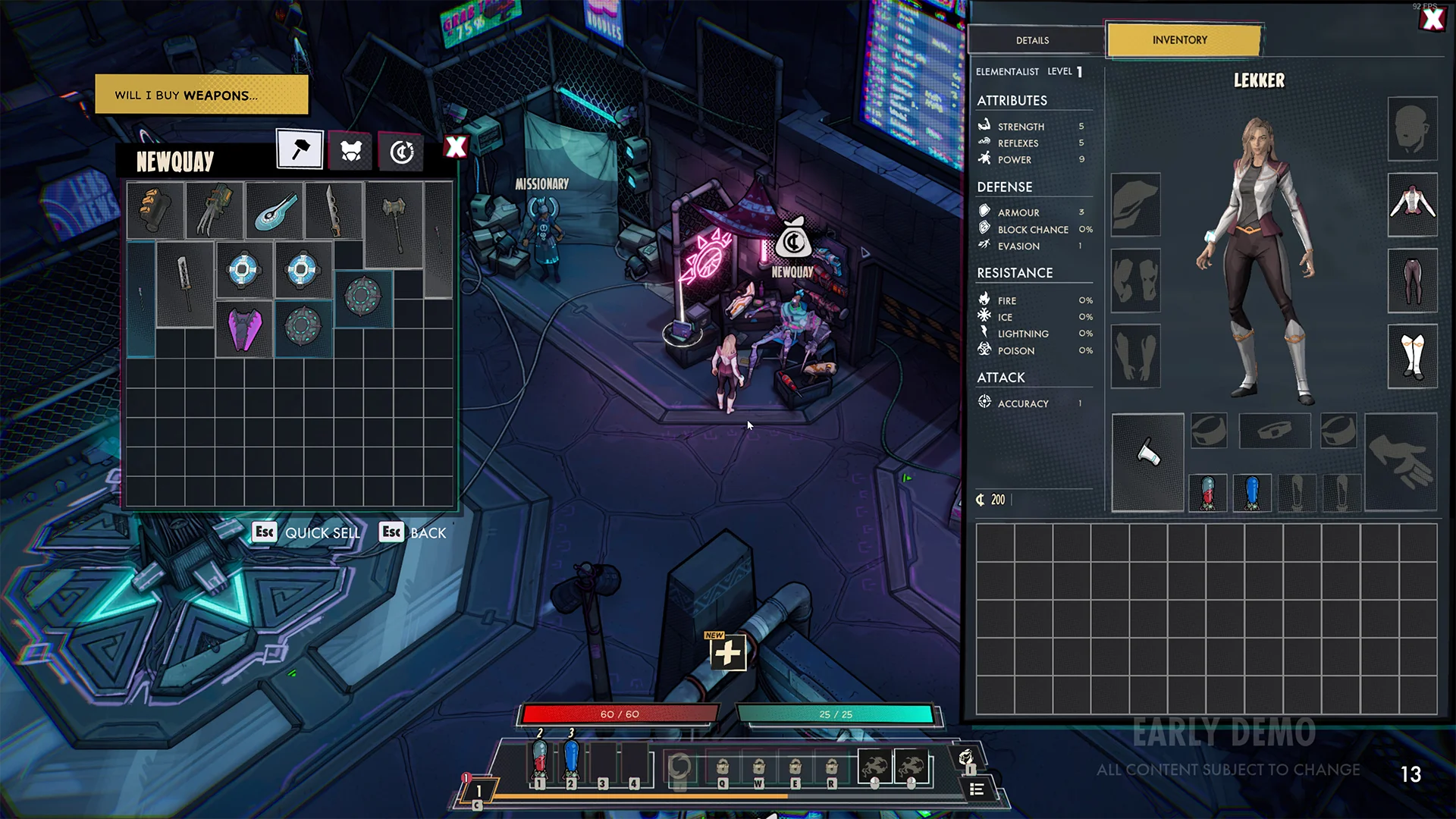
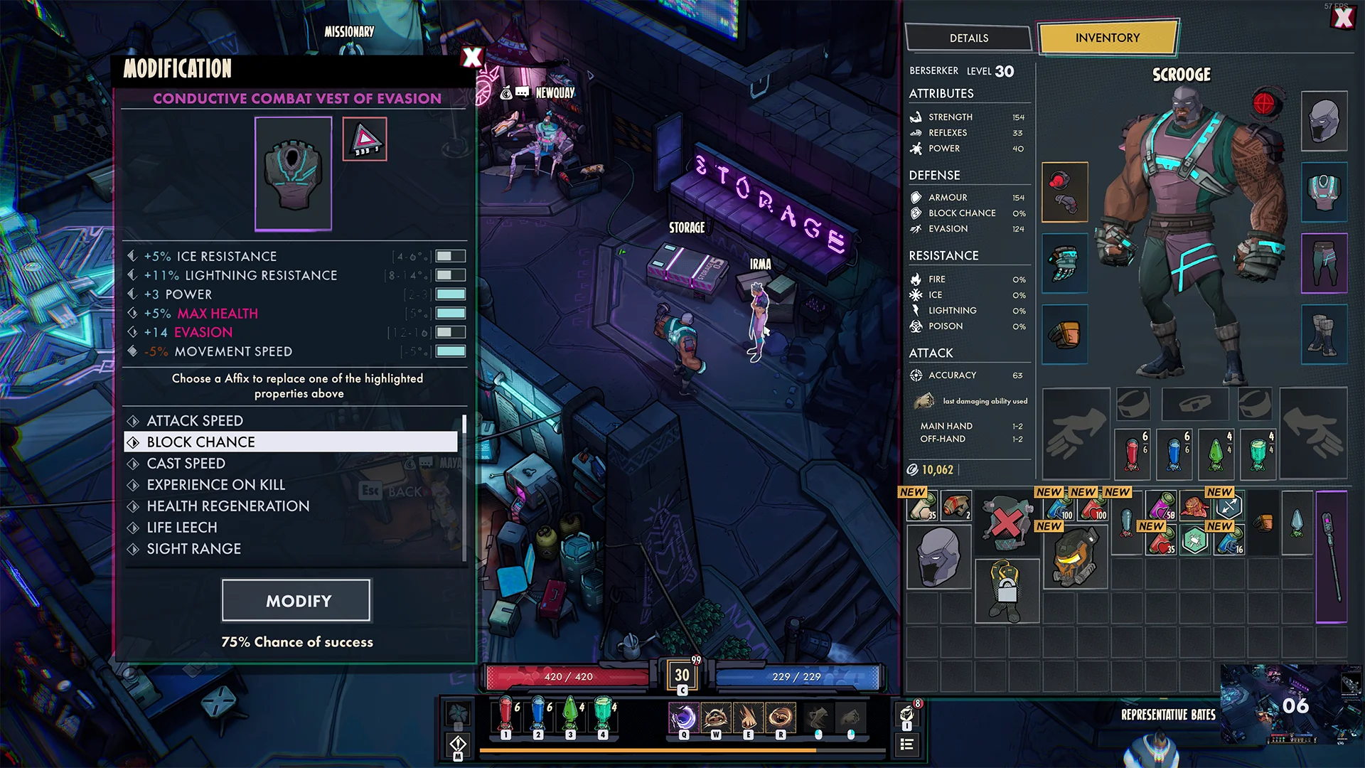
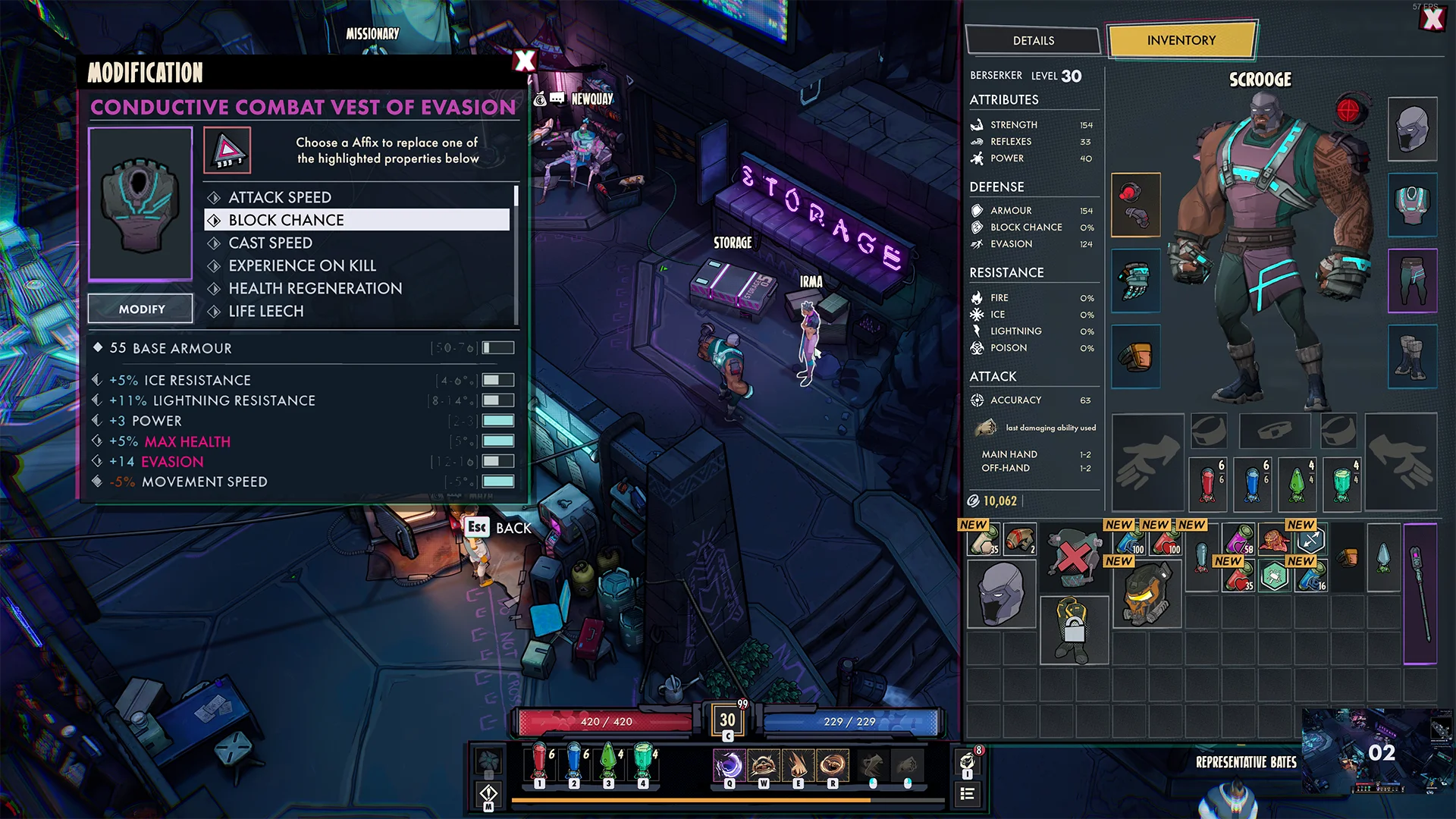
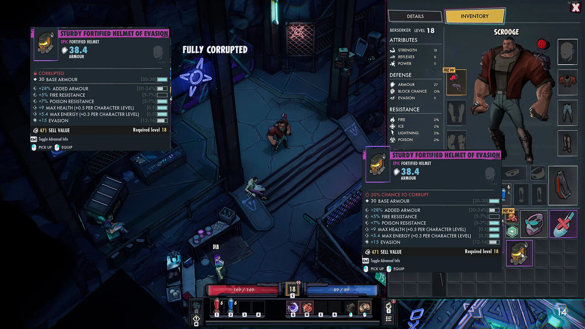
INVENTORY
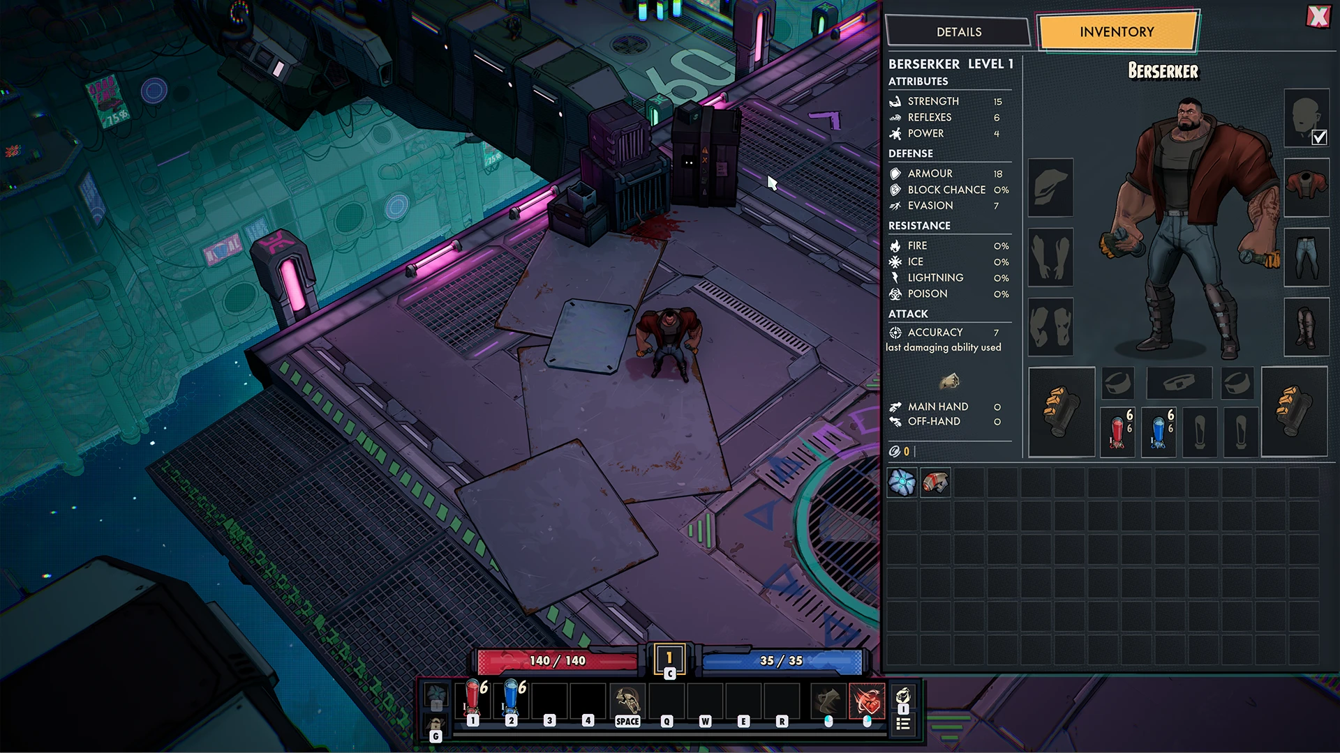
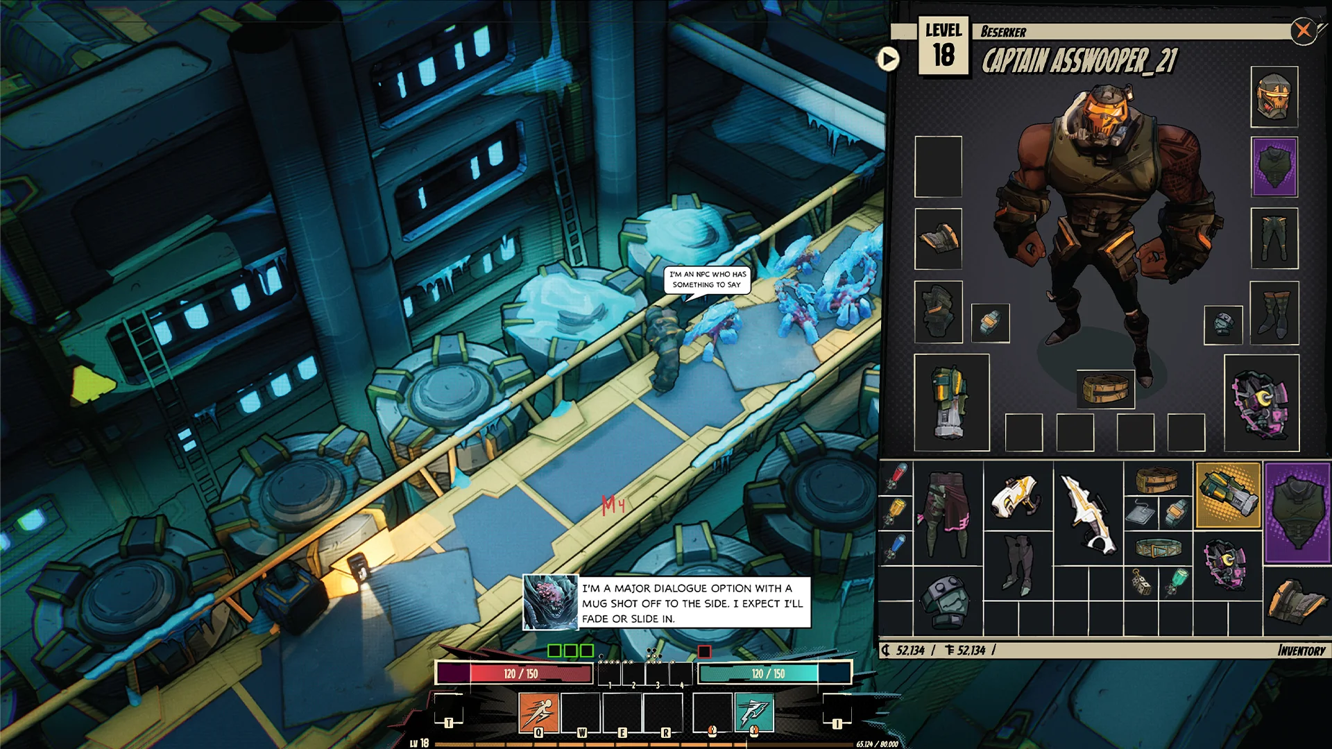
Inventory - In game
I am happy with how the inventory visuals came to be, it turned out very clean and its something I am still proud of.
Early exploration
In the earlier days of production I wanted the inventory to feel like a sort of comic book front cover, I still quite like this.
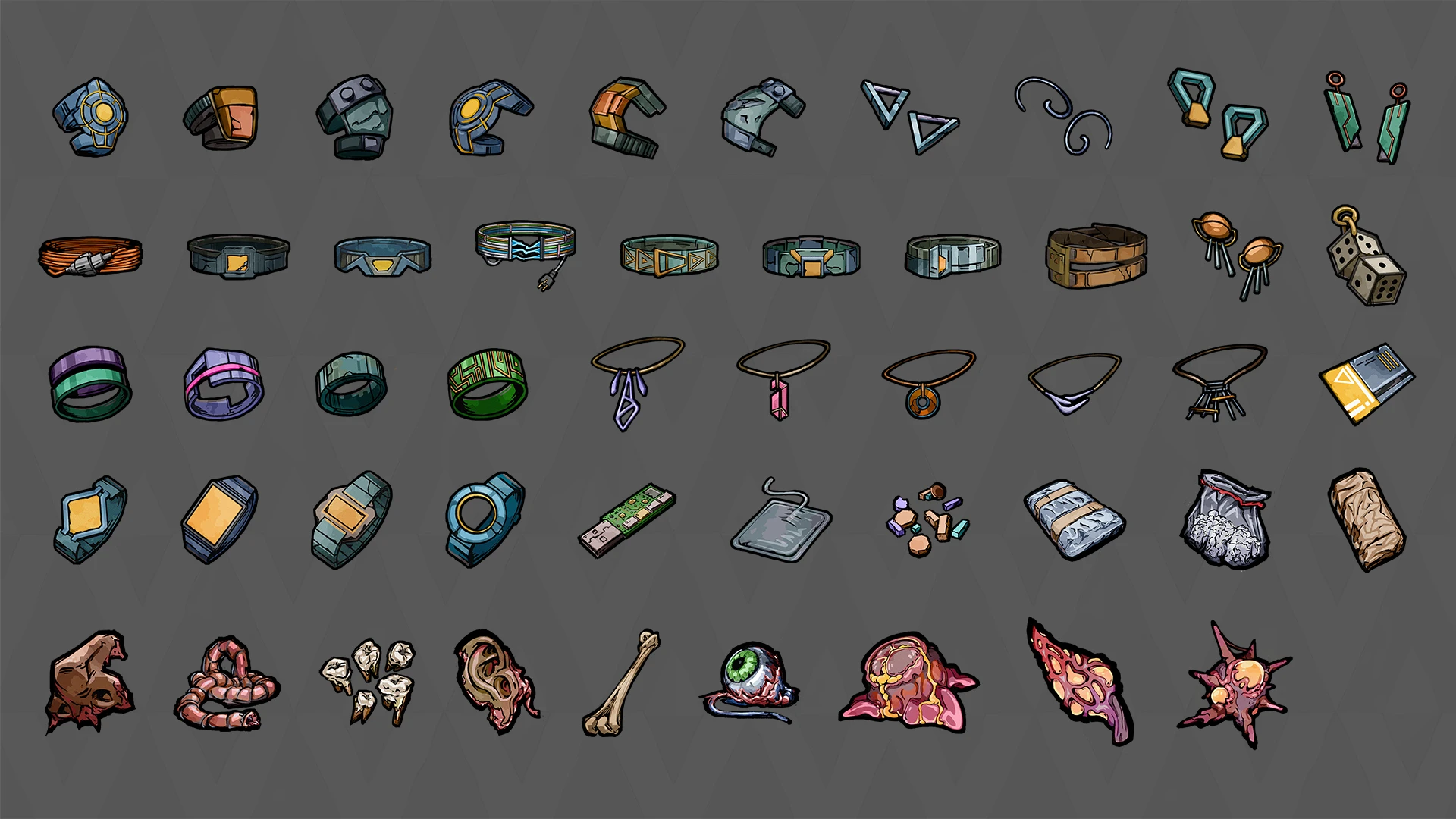
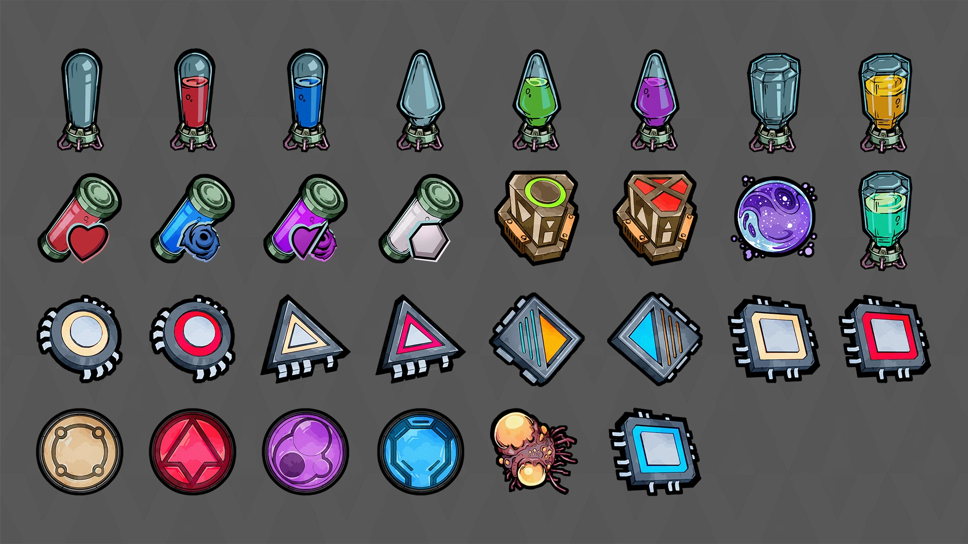
Item textures
I've set up a texture art style pipeline so I could easily create more icons.
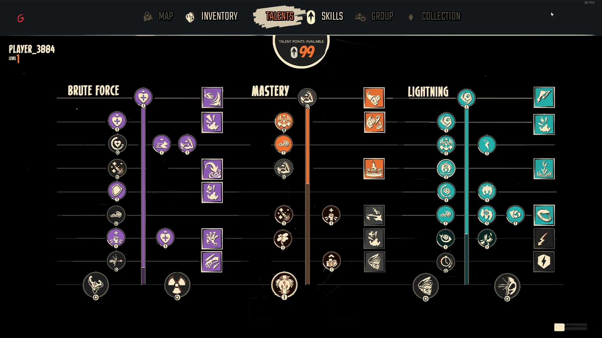
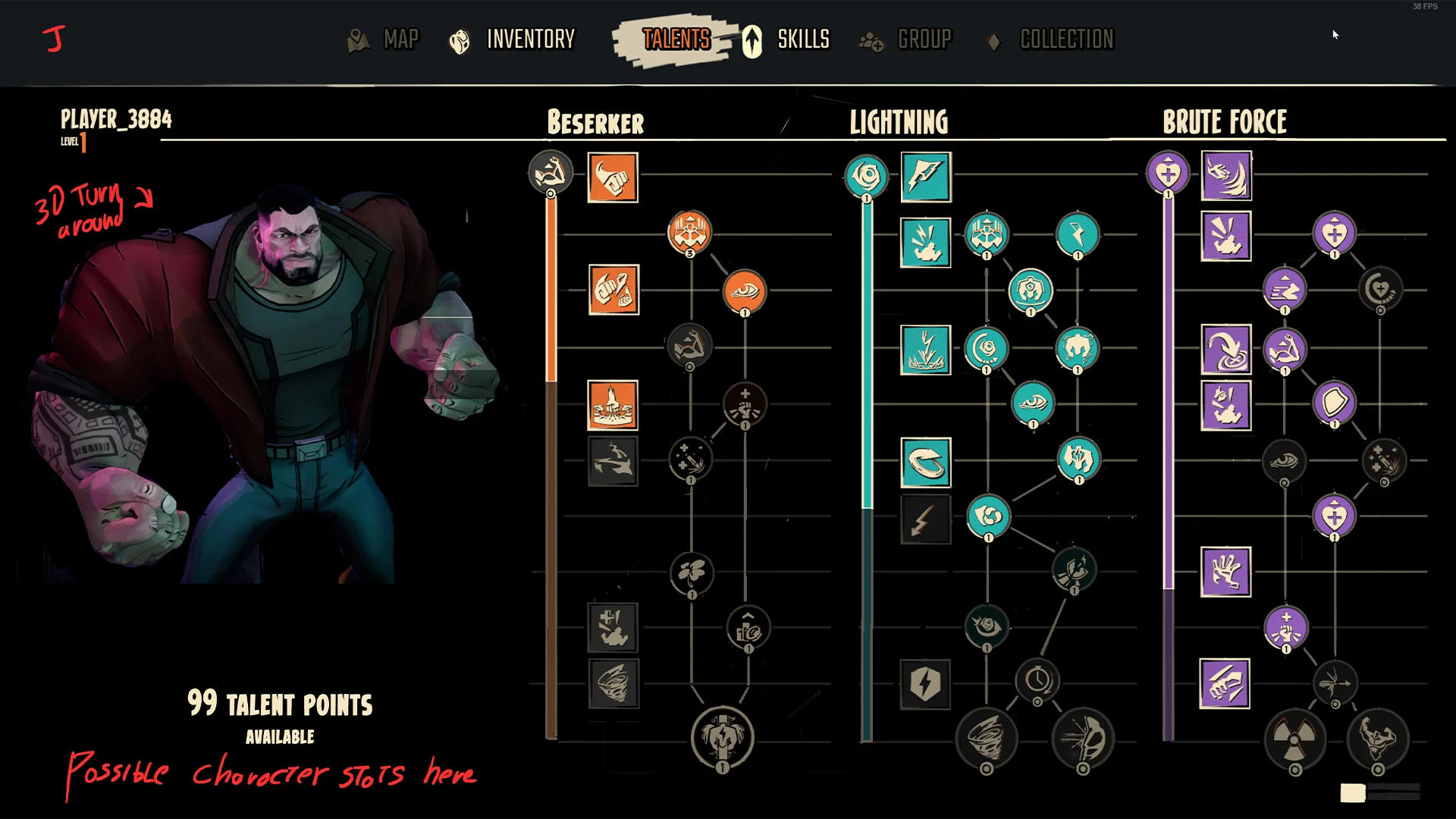
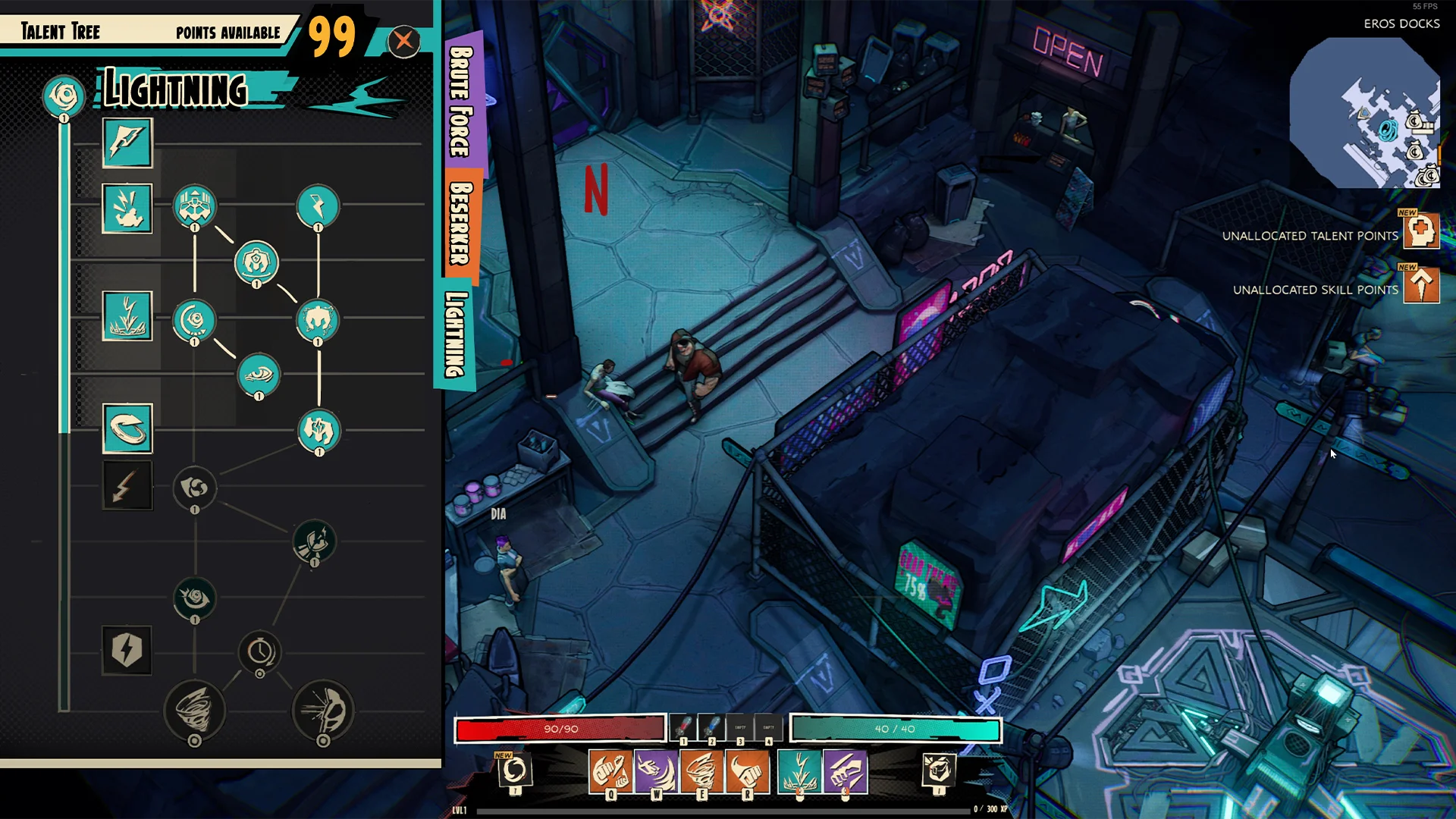
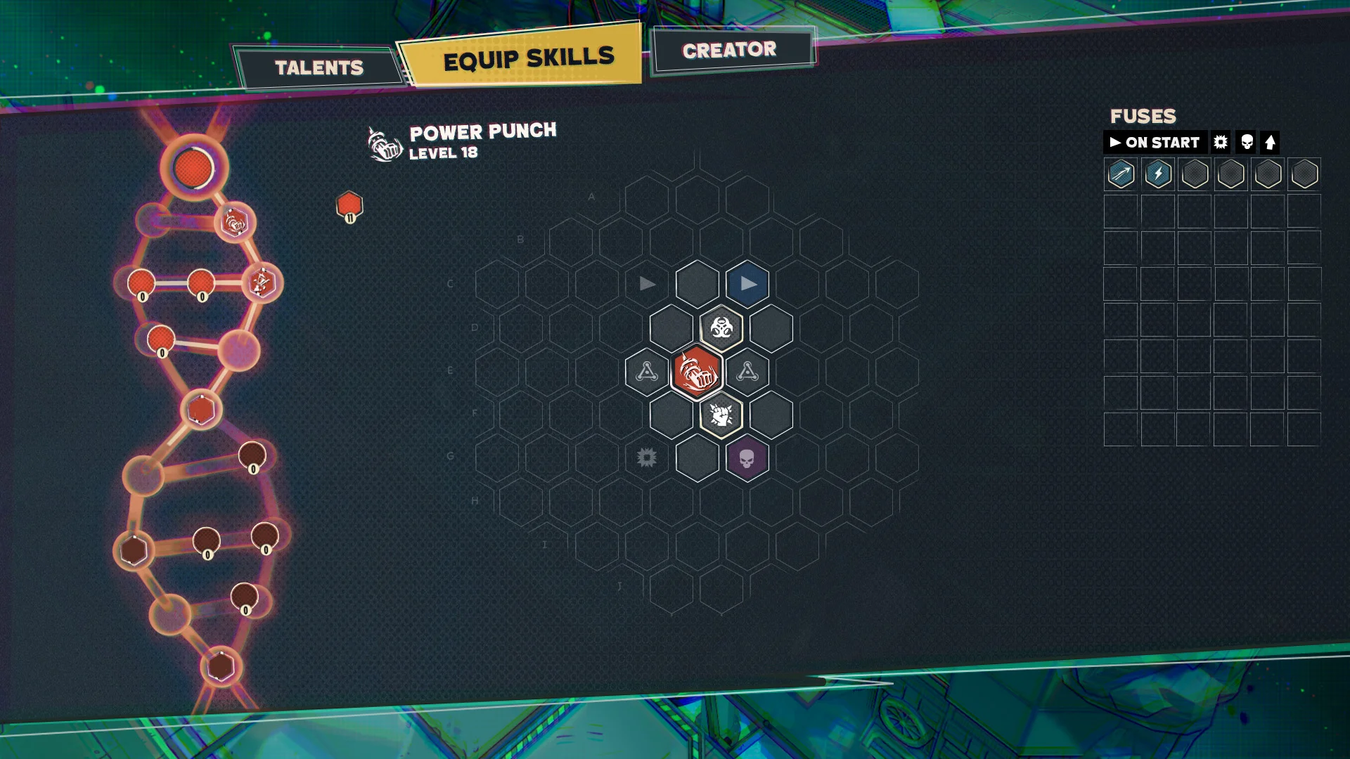
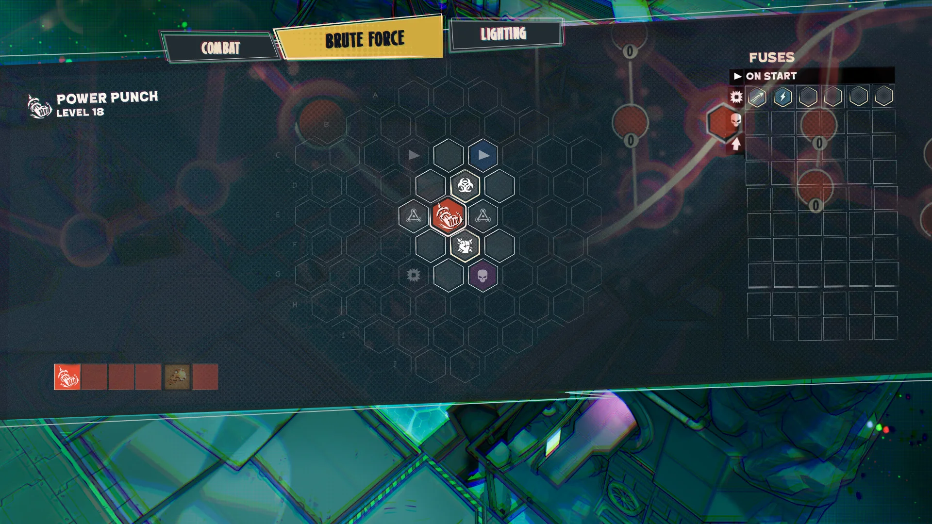
TALENT TREE
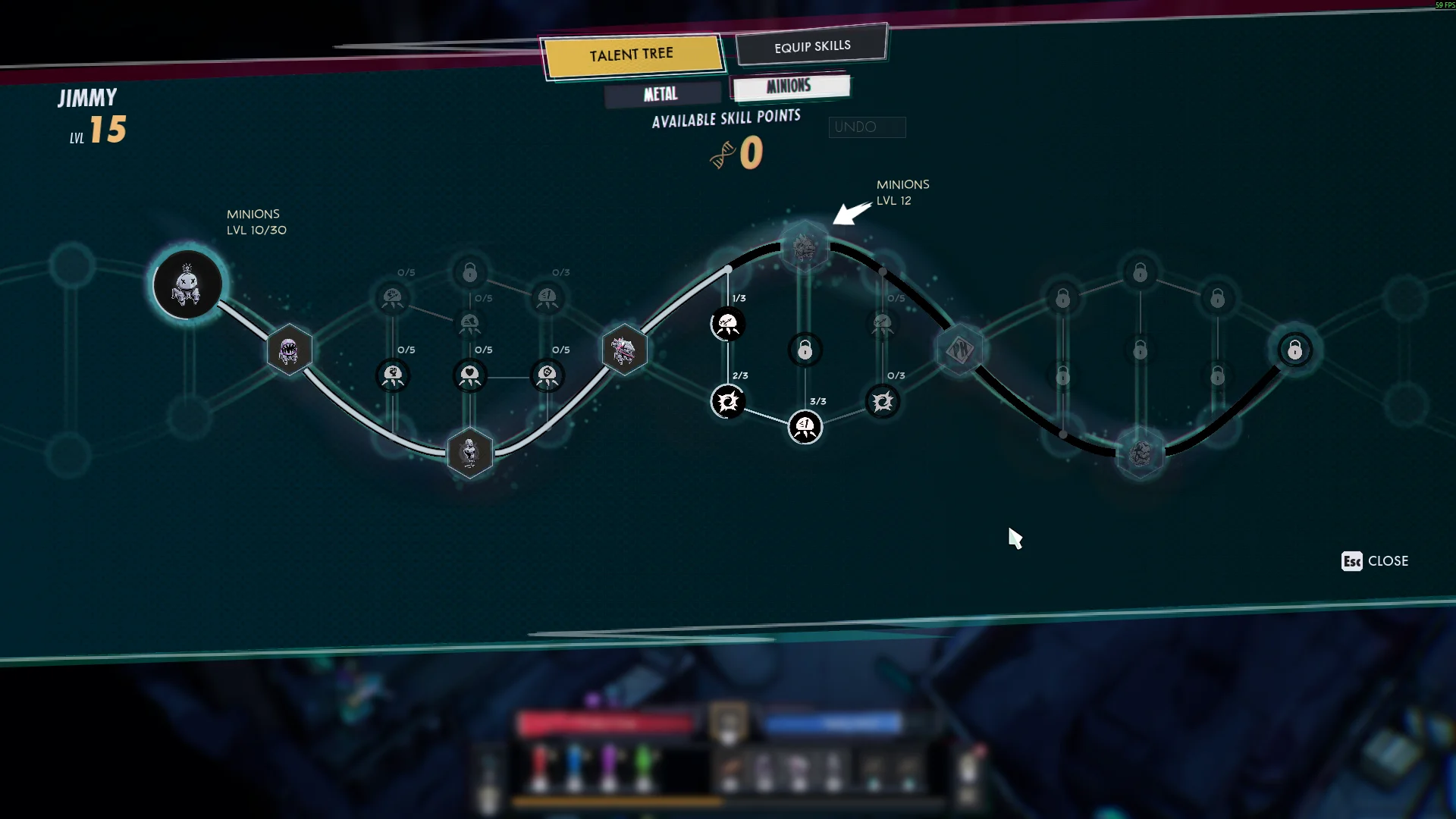
Talent tree - In game
It's a UI screen that can easily feel overwhelming, especially with all the different nodes. The big challenge came from wanting to target new players but at the same time veterans. So you want the complexity with tons of choices, but at the same time it should be simple and easy to understand. Creating the new version of the talent tree felt really cool, it was visually a lot more impressive than before and the idea of the DNA worked out well.
Early explorations
During these stages it was quite difficult to find something that landed well. There are 3 different skill trees and I wanted to showcase all of them at the same time. I came to realize this just didn’t work, it was too much clutter.
Finding a hook
Doing a few iterations landed one with a DNA visual in it. This seemed quite interesting and we proceeded forward with designing the talent tree around it.
Refining
This is what we landed on for a while it was visually pleasing and helped digest the information of the skill trees better.
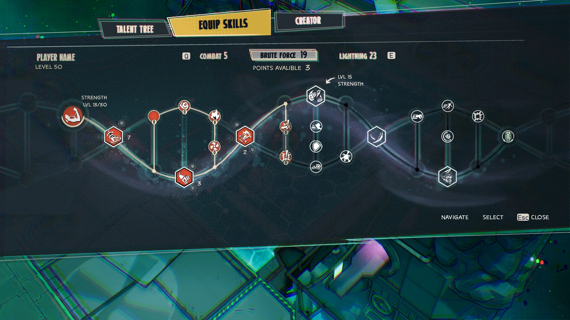
Finding a hook
I wanted to integrate the new tree with the fuse system, the idea was that selecting a node in the tree would zoom in and open up the fuse menu. In the background you can still see the talent tree.
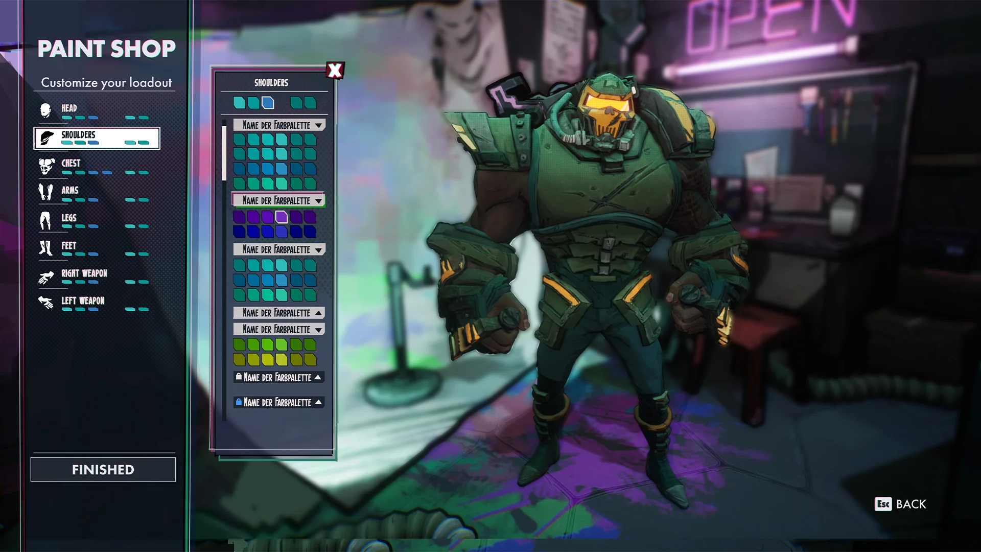
PAINT SHOP
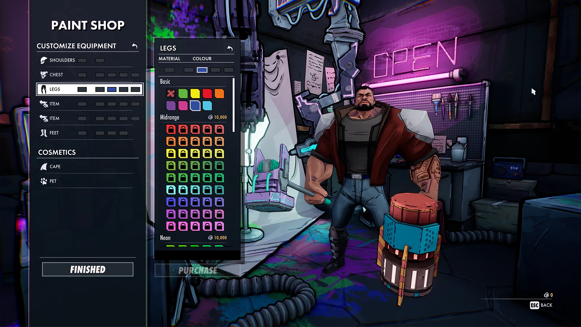
Paint shop - In game
This menu had a few constraints that added to some UX complexities, I had to design around money sinks, materials and multiple color slots, but I think I managed to go about it.
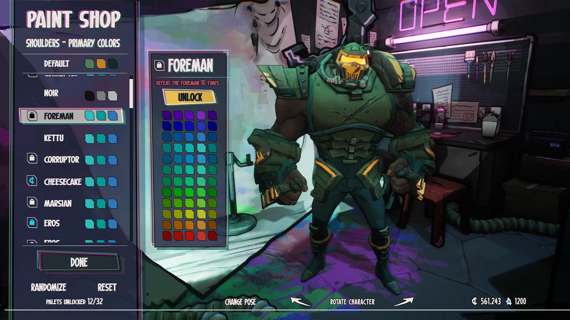
Unlock colors
As a nice addition I thought color scheme unlocking could be nice quest rewards but this never got pushed forward.
Keeping it simple
In one of the early iterations we used tabs to separate the bulk of colors. The idea was that down the line we would hook these up to unlocks.
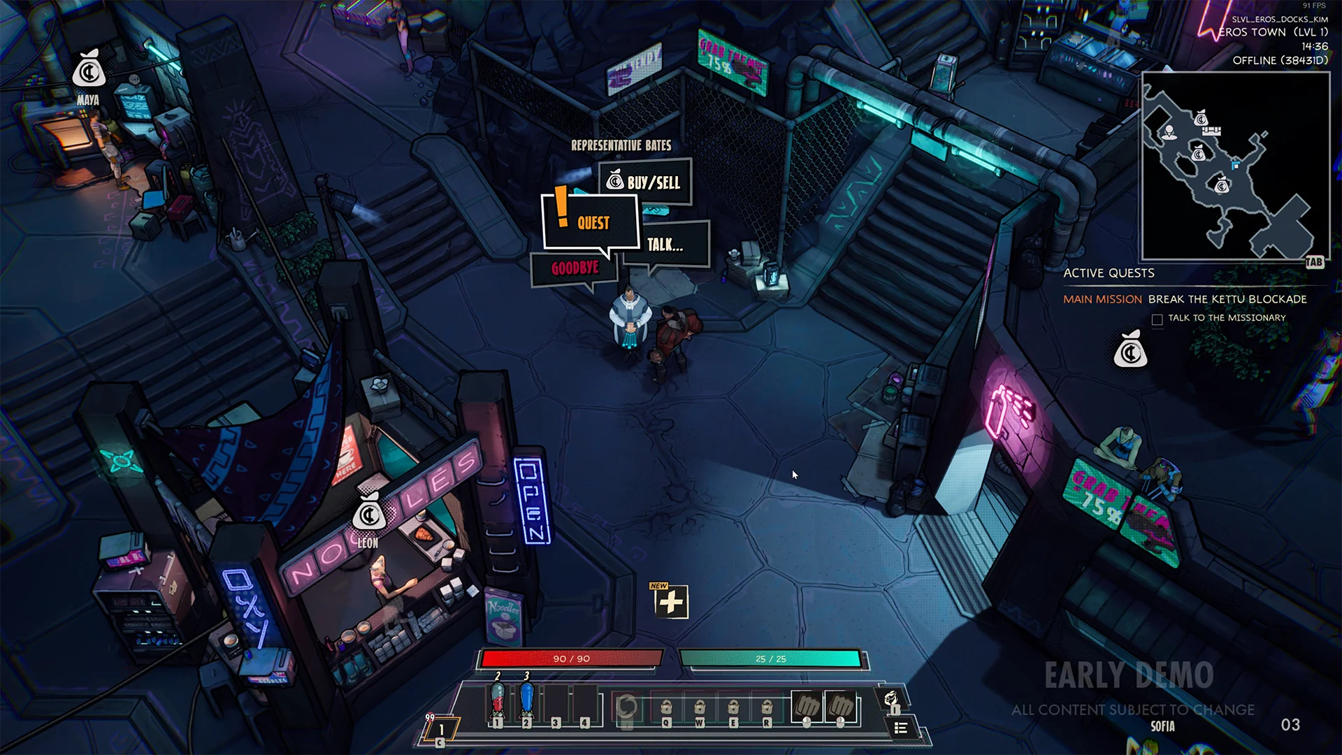
DIALOGUE MENU
Dialogue menu - Mockup
In the end I did use a comic book text box and the options have clear navigation with a little icon helping to more quickly identify what these options are.
Early exploration
I really liked the idea of comic book windows, however I don’t think the navigation flow is as clear.
Refining
Wanted to try a different approach but again I think the flow of it isn’t as nice, the arrows pointing at goodbye is something I didn’t like.
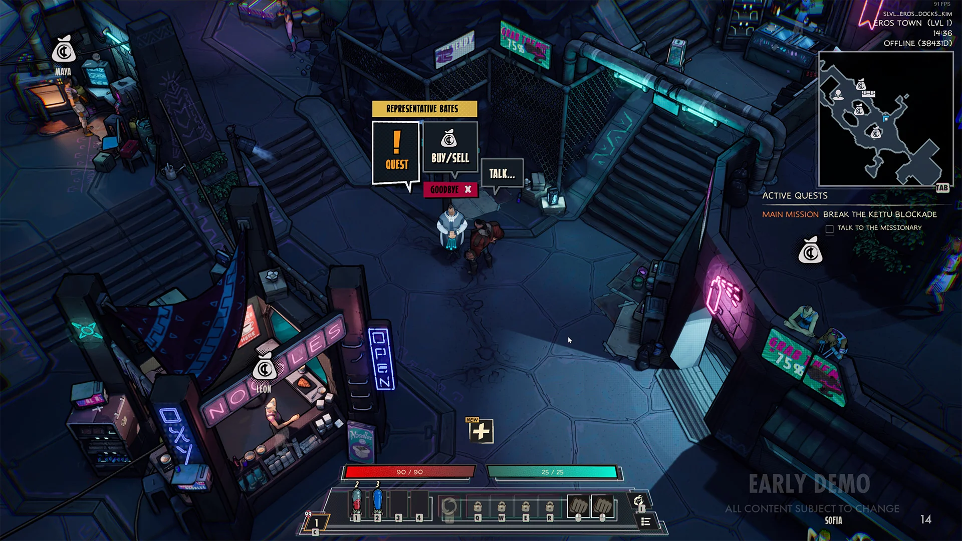
Shopping
Using the yellow box as a characters thought while also signposting what you can do in the menu.
CRAFTING MENU
Crafting menu - Mockup
There is a lot going on in a crafting system and translating that to easy to digest UI is a challenge. I had to collaborate with a designer on this, he would really understand this system and I would turn his paper design into a mockup, I always enjoy having collaborative moments like this.
Early exploration
During the early stages I liked the idea of a more compact menu, but because of space issues we ended up going for something bigger to give the elements some more room to breathe. I do still like the design.
Tooltips
The tooltips in Superfuse are quite packed, it's something that will just happen. The items need a ton of information and from time to time we came back to it to add more. During the crafting menu feature I needed to create some mockups to visualize how the corrupted items would look.
Crafting animations
I always like experimenting with the UI animations. There are a lot of ways to make the game feel more juicy, the crafting animations have good potential for that. I wanted the player to feel excited when seeing a success and feel dreadful when the item corrupts.
CLOSING WORDS
Thank you
Superfuse is a very special project to me and I will never forget the amazing people I had the honor of working with. During this project I made a switch to become a full-time UI/UX designer, I have learned so much.
CONTACT
Let's get in touch!


