A multiplayer party game.
I was tasked with create the project UX and set up placeholder UI. Despite the short project duration I was able to learn a LOT about UX and setting up wireframes and prototypes.
PROJECT UX FLOW
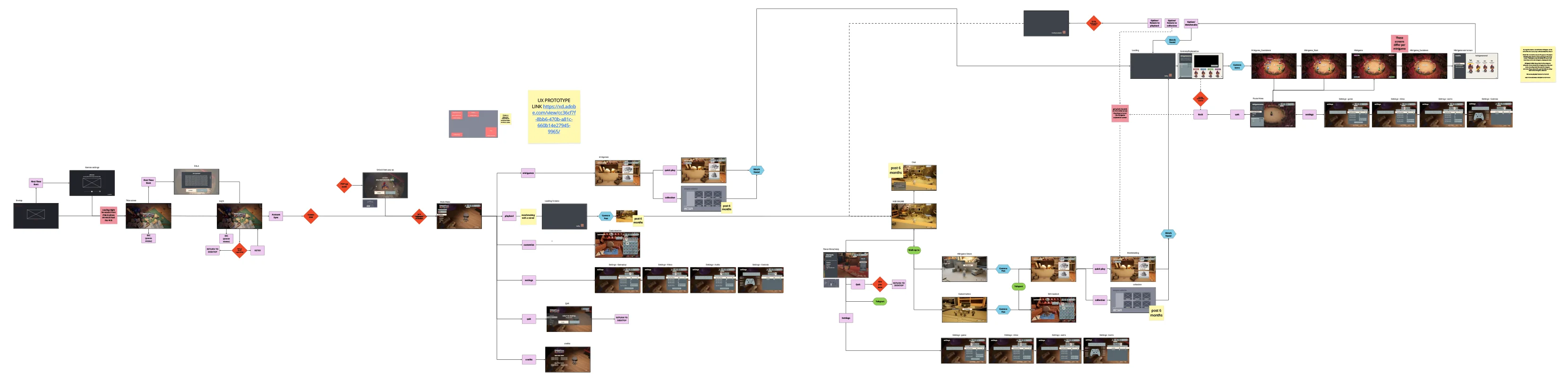
Project UX
Using the mockups and wireframes I was able to create the project flow in Miro. I kept this up to date as we kept developing the project and integrated client feedback into it. I also provided them with a prototype of the flow.
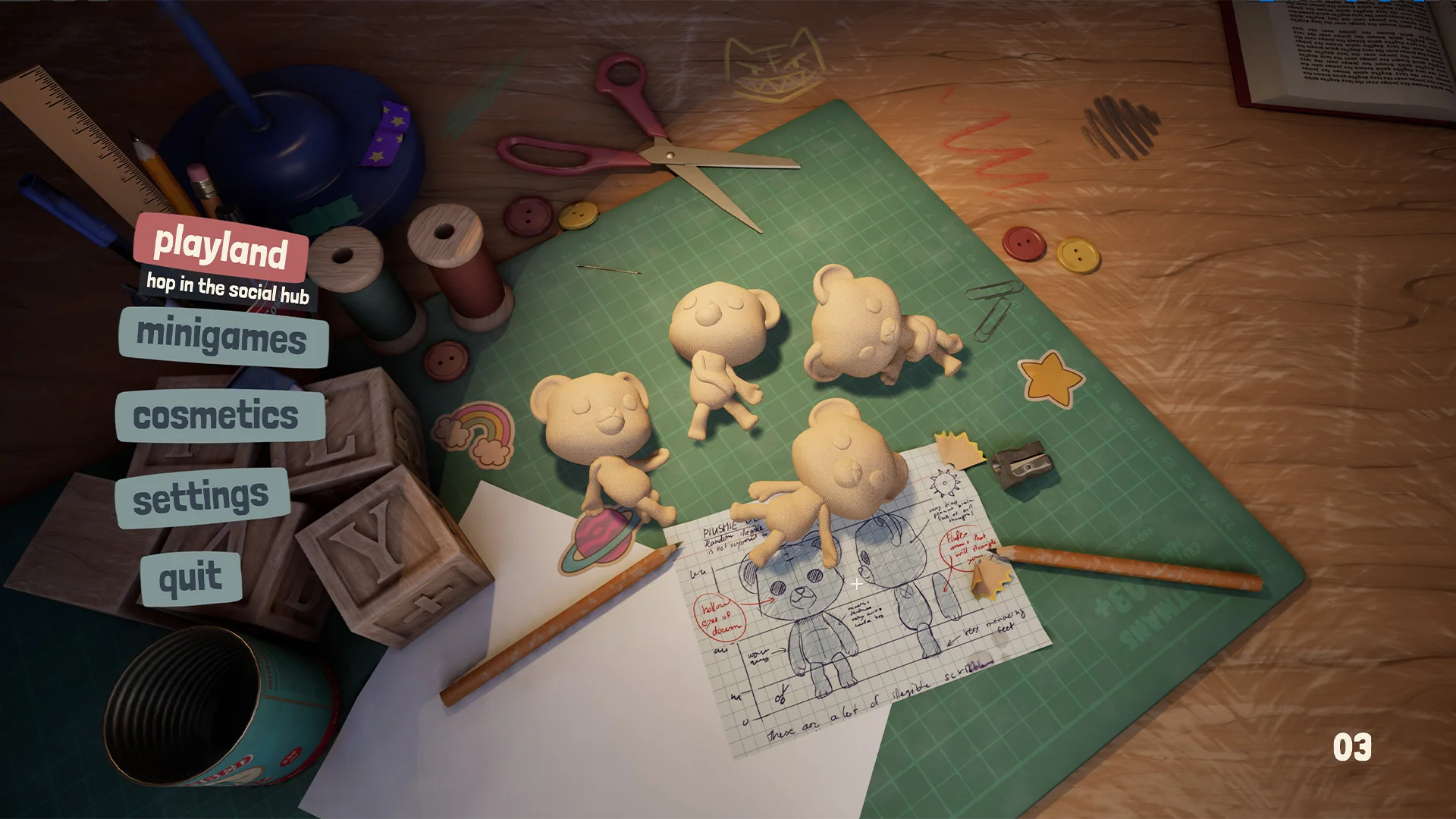
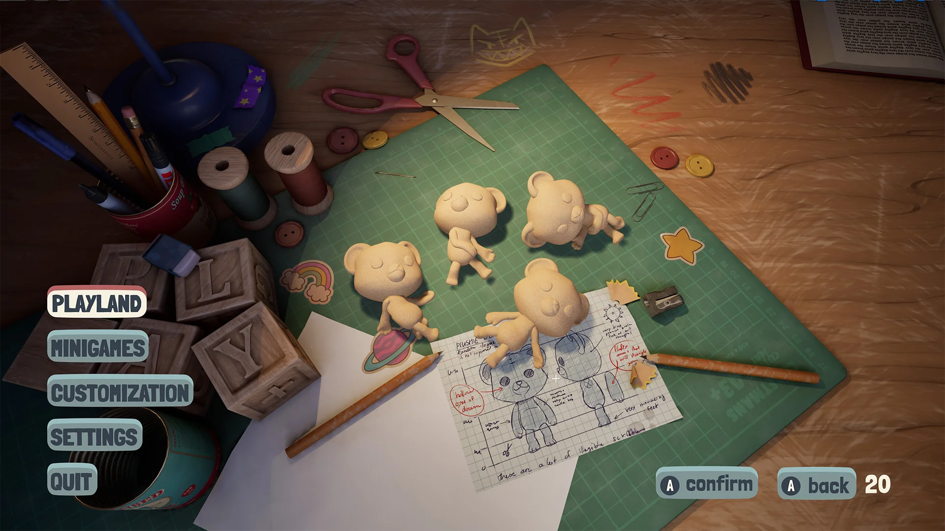
MAIN MENU
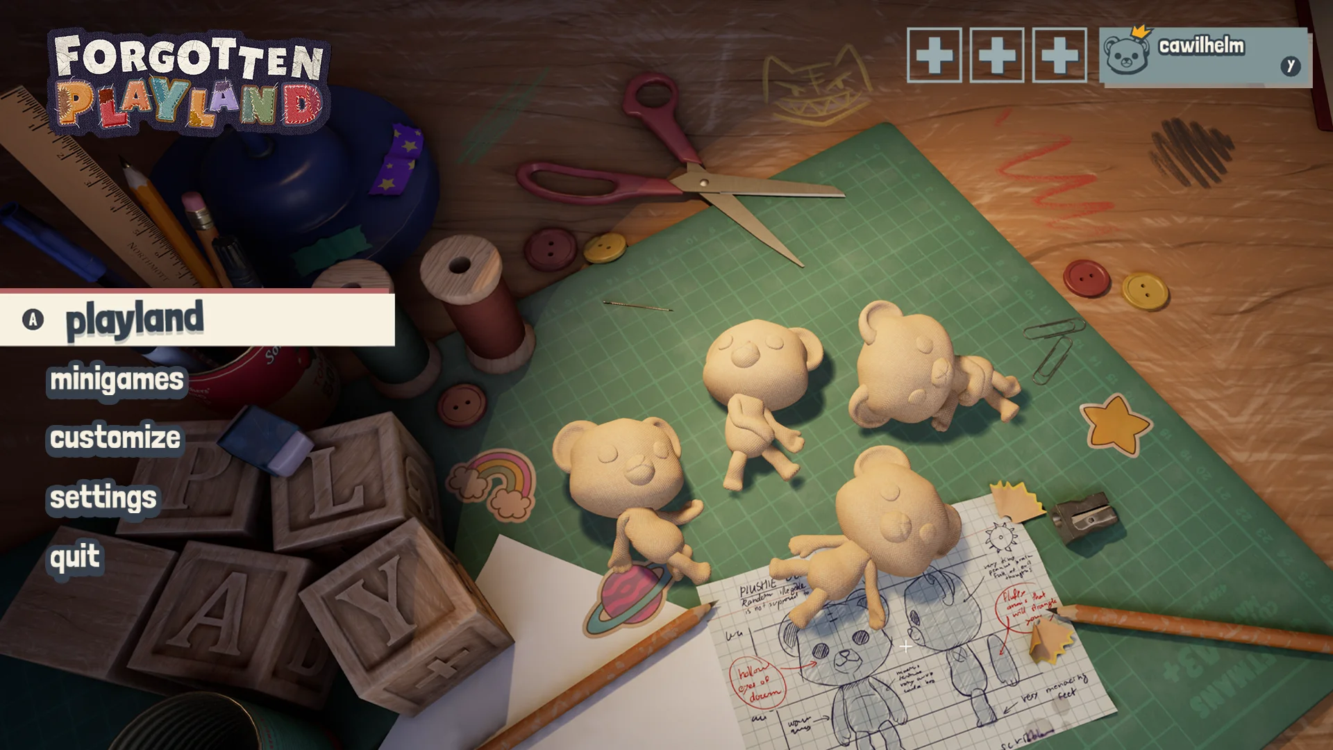
Main menu - In game
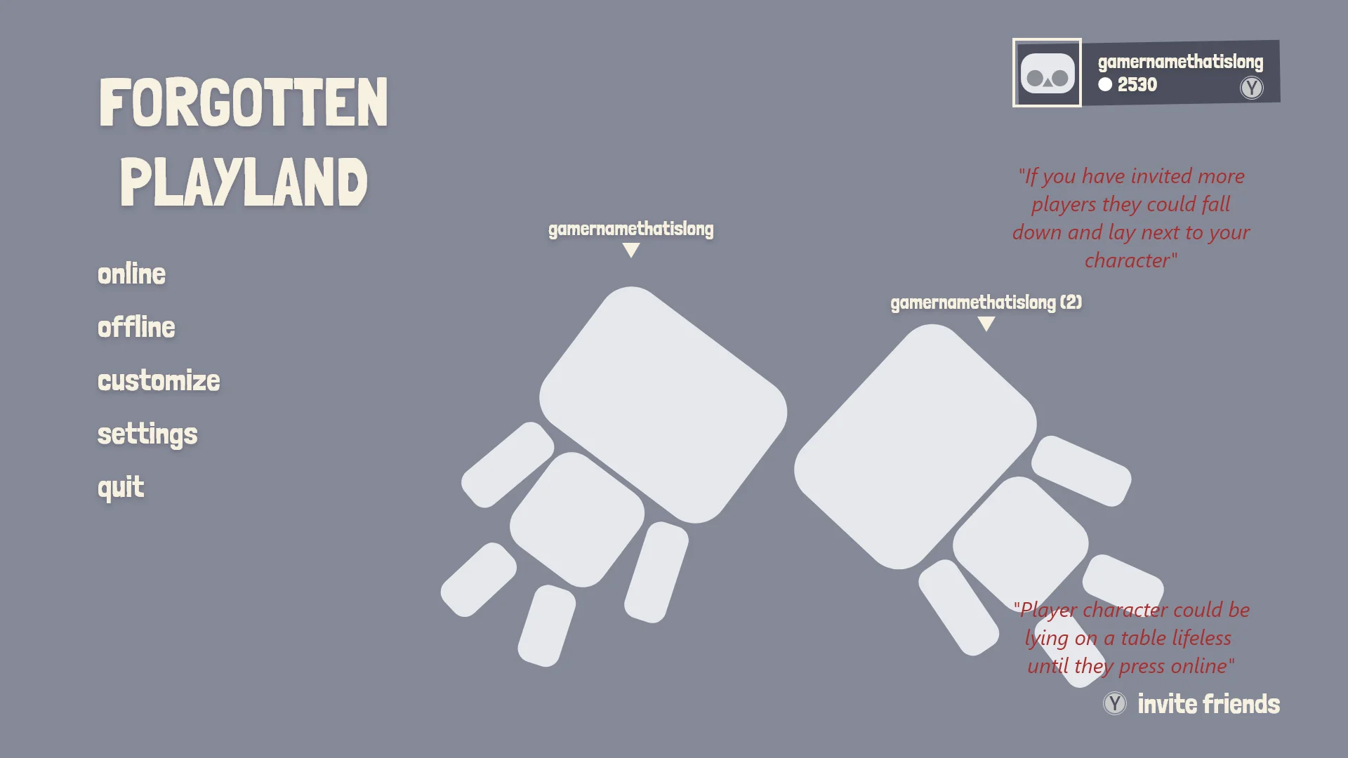
At first we wanted to also have an easy access to features that could also be used offline. This way players could use local co-op. If you invite someone to your party in the main menu another character would drop in from the top of the screen. That player character would display their equipped cosmetics.
Something I had to think about a lot was placement consistency of elements. The profile of the player is an element I wanted to have consistent across all screens.
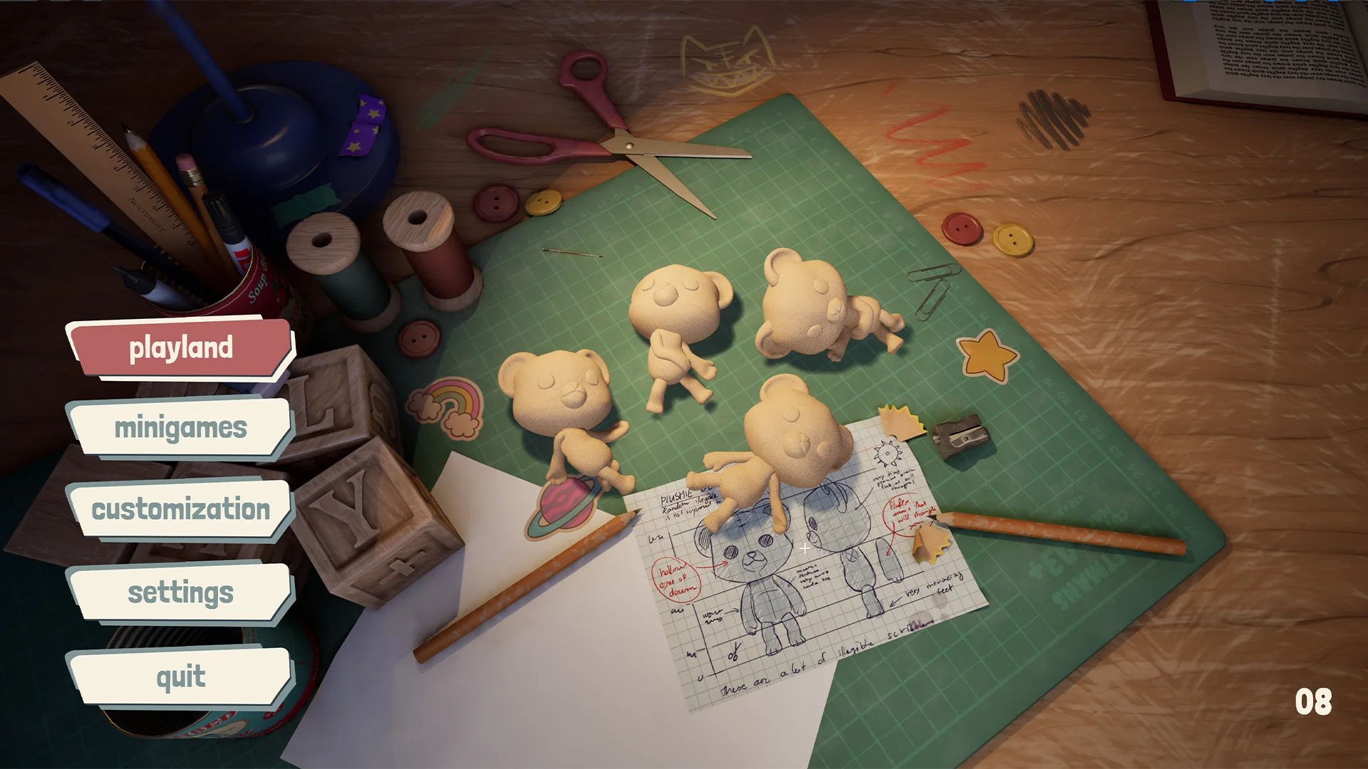
Main menu - UX
I had the idea that the toys could be lifeless in the main menu and if you would start to play they would jump up and start walking off the table into the play area.
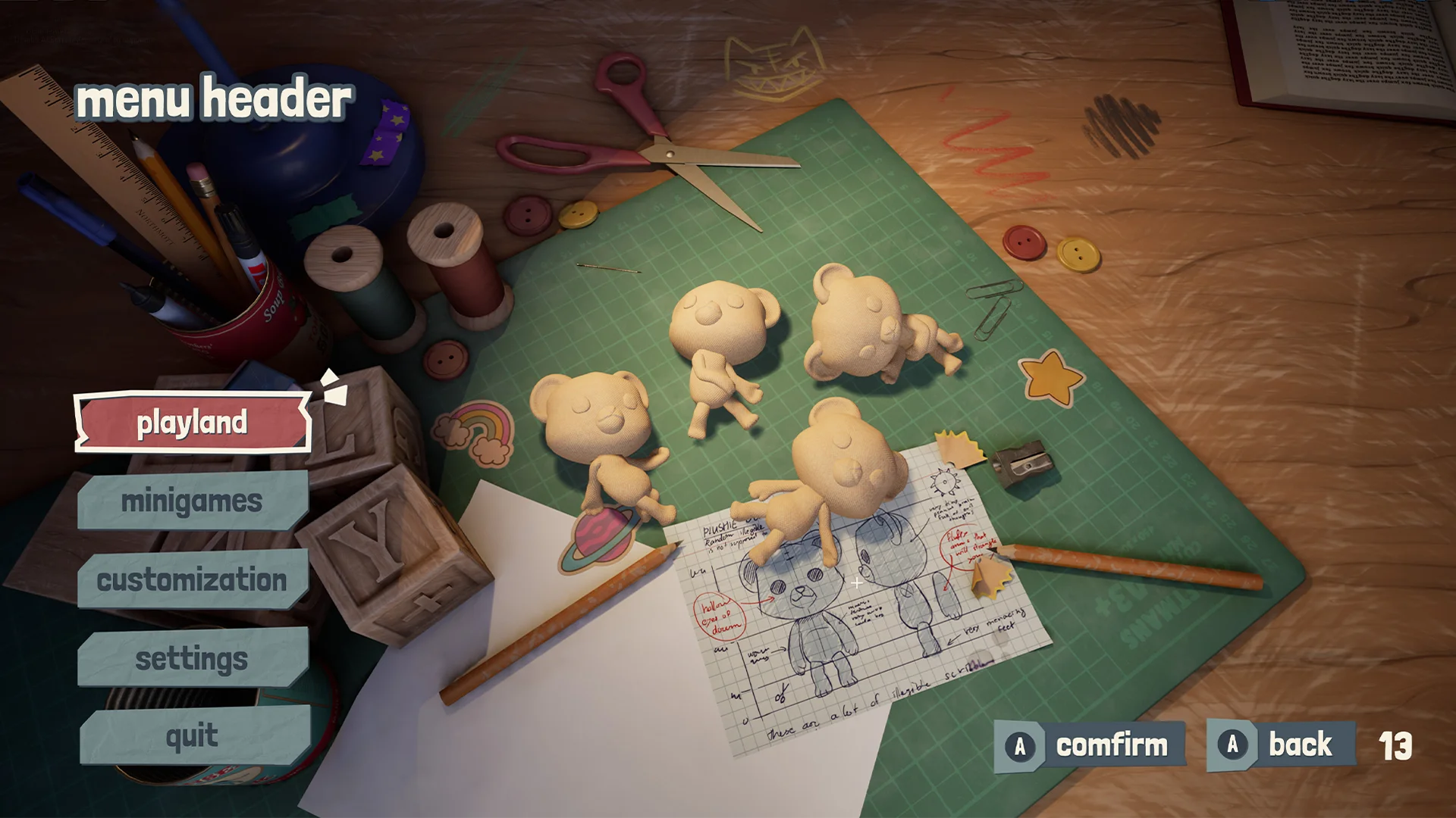
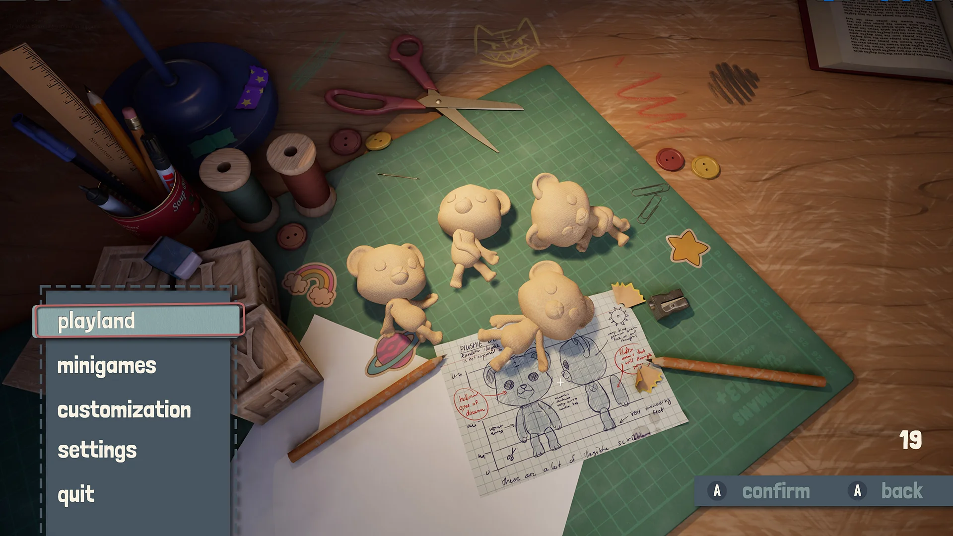
Exploring different styles
While the main menu worked I always thought it could look more interesting visually. This was additional work that the team after us could use as inspiration.
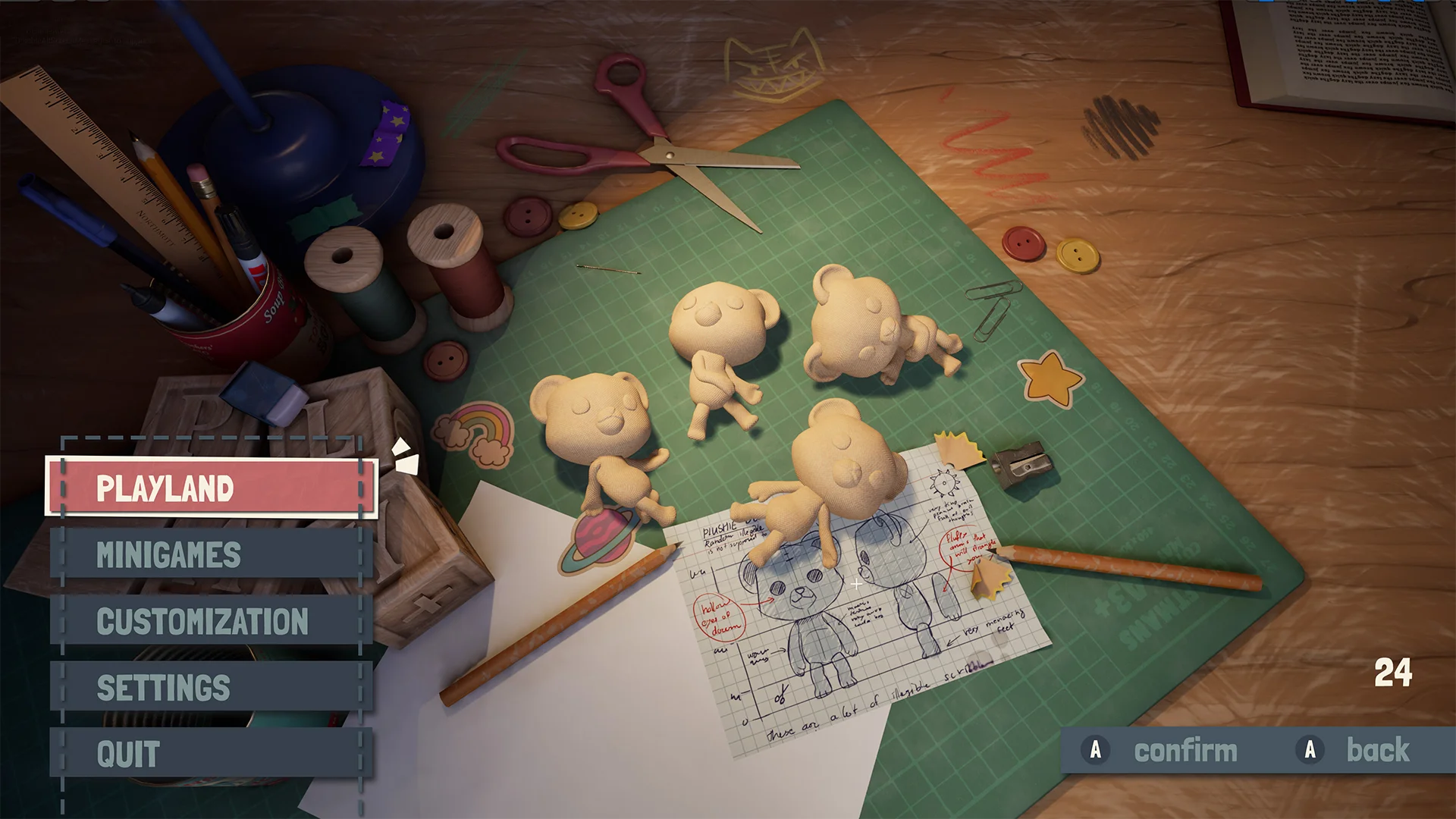
Main menu pop-up
If a player would have bought a new cosmetic outside the game this would popup if they launched the game.
CUSTOMIZATION MENU
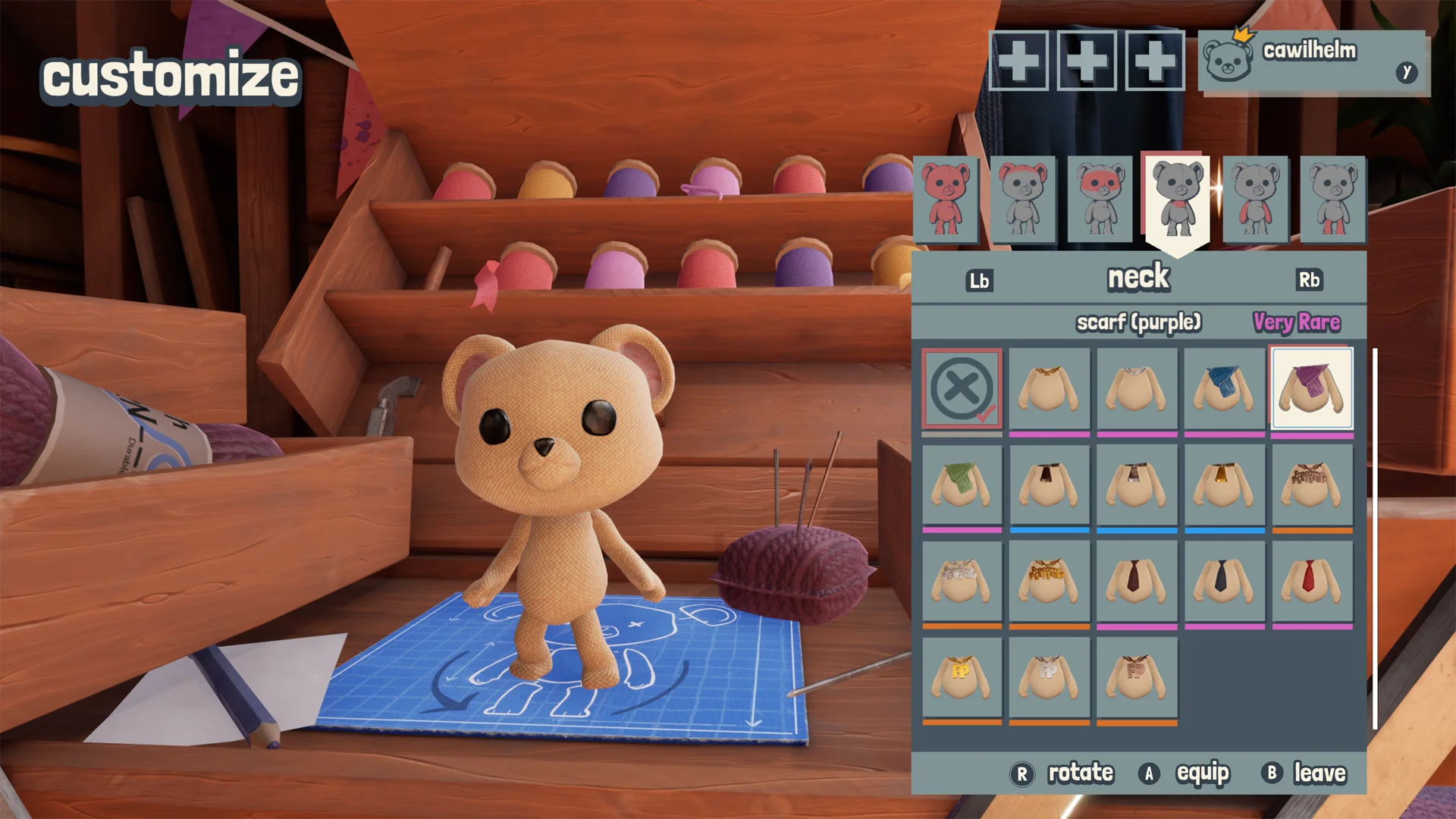
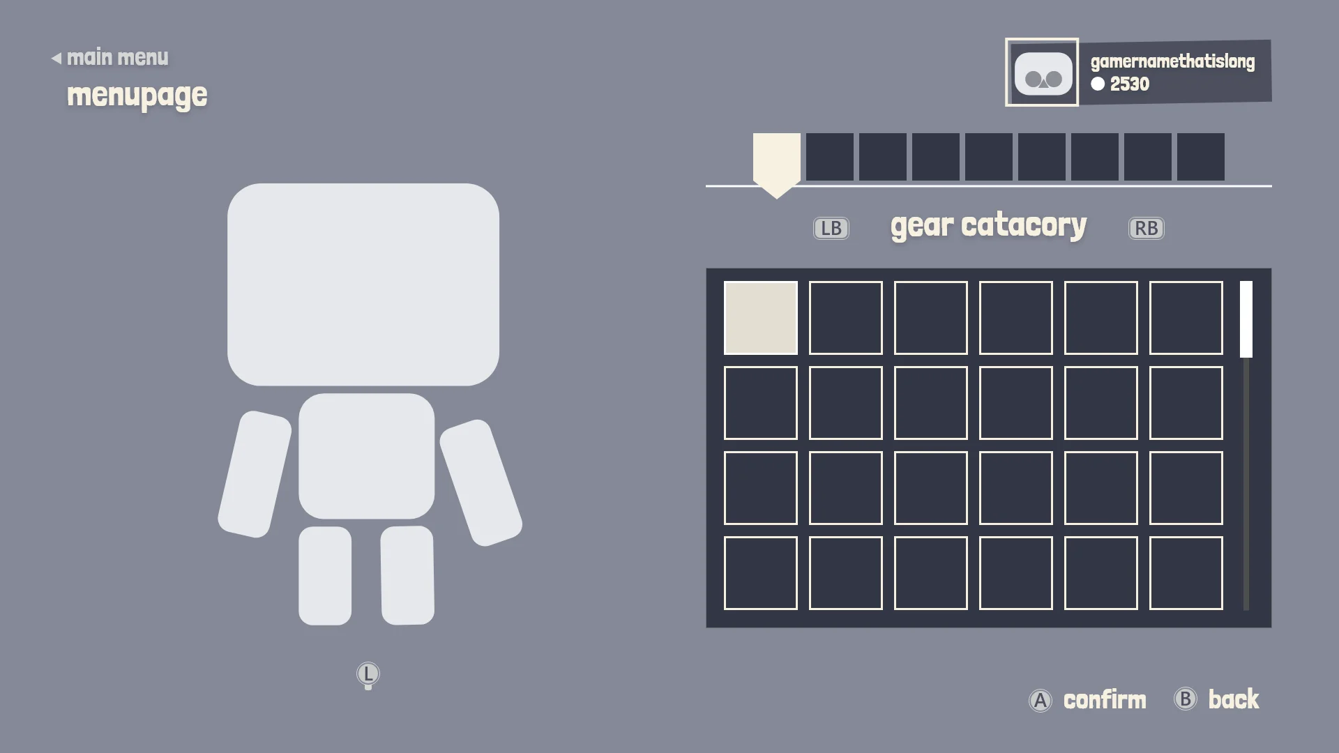
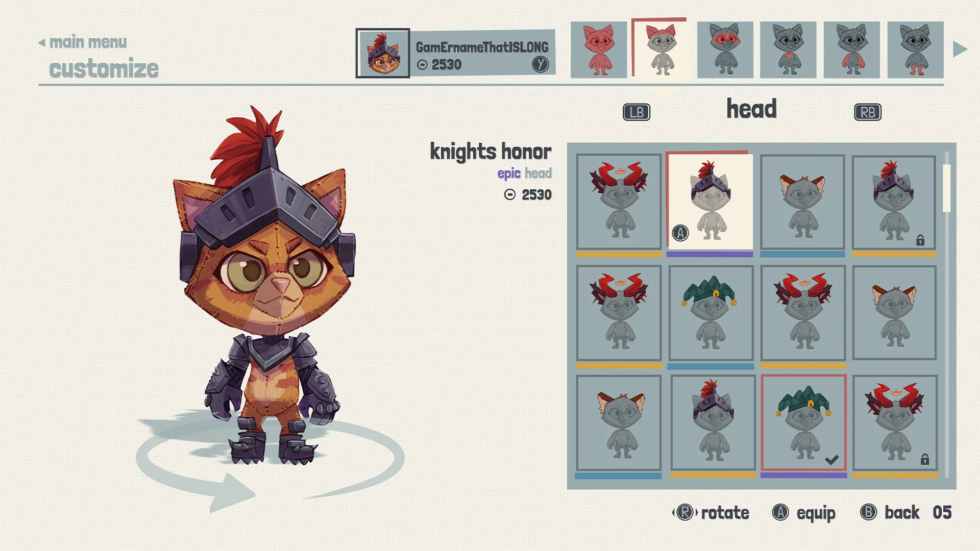
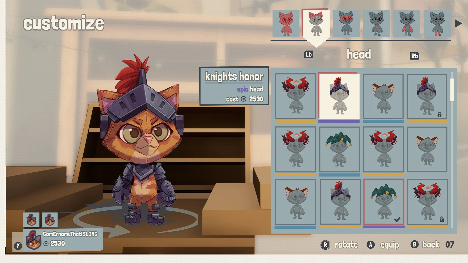
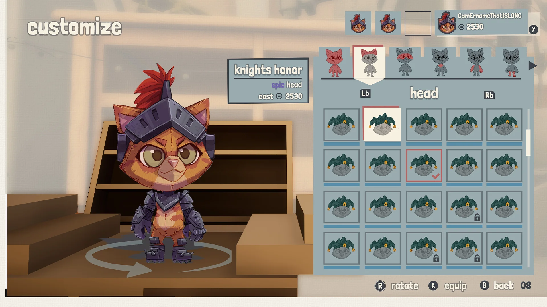
Customization menu - in game
There were some UX struggles, especially with maintaining consistency across screens. The menu header and the profile made this a bit complicated.
Early UX exploration
At the start of creating the wireframe there is still a lot of design decisions that need to happen so I tried keeping the wireframes a bit simple with a general layout.
Early UI mockups
During the mockup phase, more information comes in and I continue to iterate and develop the screen.
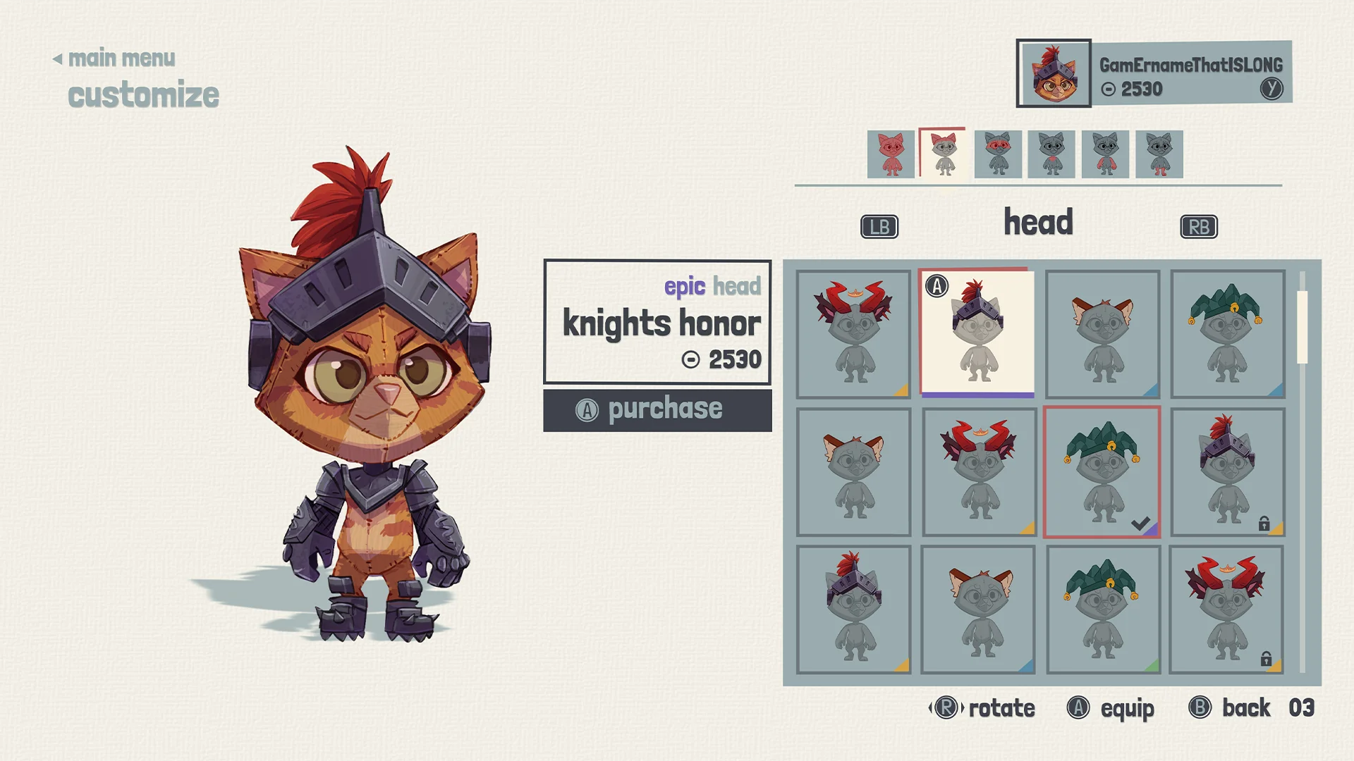
Customization menu - Mockup
After a while we decided that we would use the playland HUB backgrounds during the menu’s. I always kind of liked the white textured background, it made the menu feel more grounded and reduced the overall screen noise.
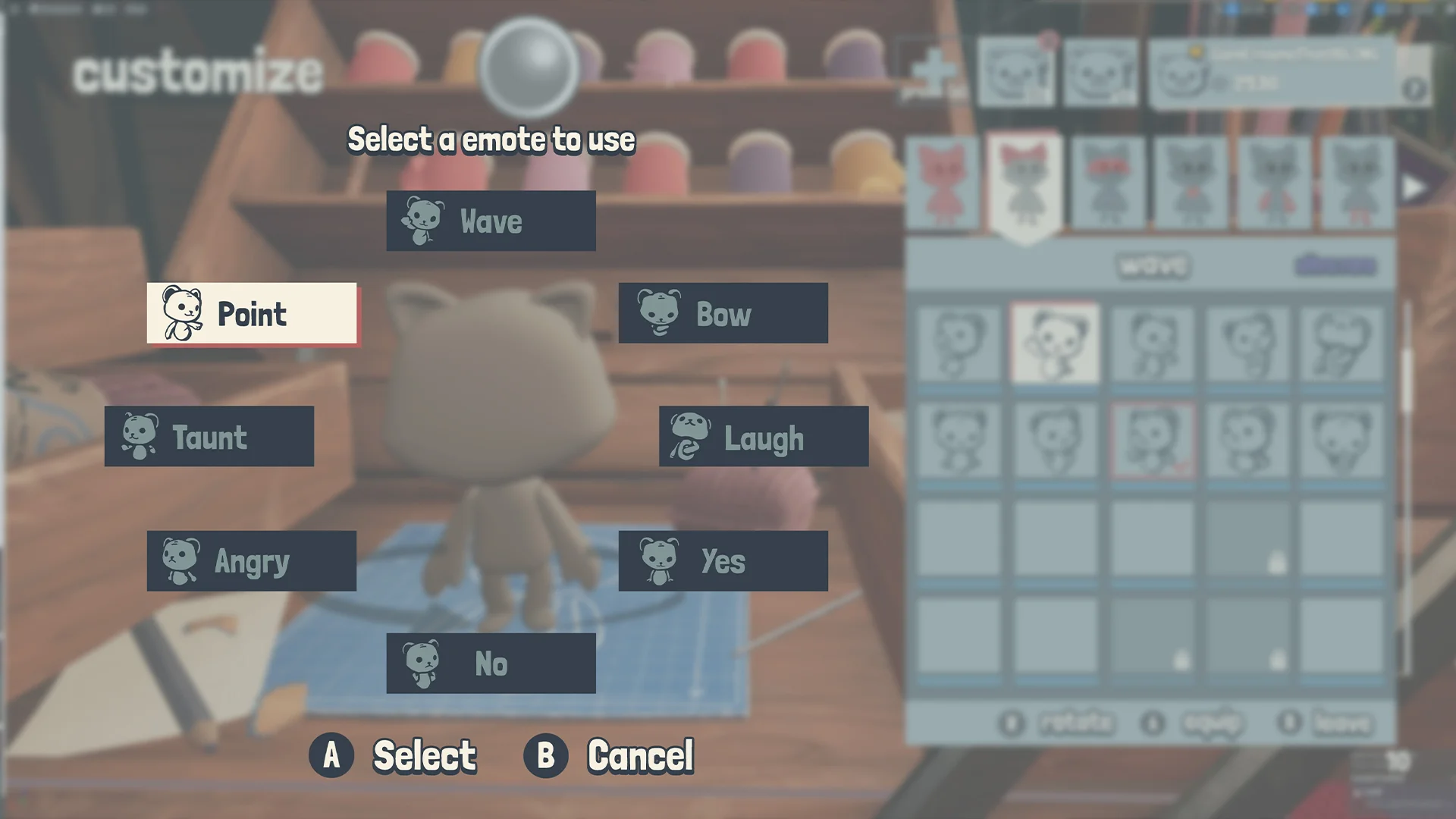
Emotes - Mockup
During the final stages of the project I created this mockup to start a conversation how we wanted to visualize the emote wheel.
Mockup development
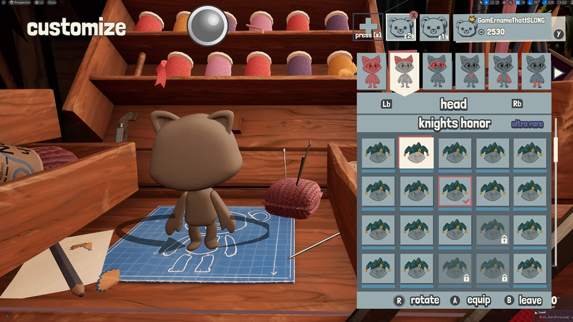
I did a lot of testing with the locations of the profile. But I knew I didn’t want to keep moving the element. During iterations I thought it would be good to add a white textured background but also use the 3D props. Having the white behind the prop, but there was sadly no scope for this.
Animation collaboration
Overall it came together very nicely. I had to collaborate with the character animator to make sure their character animations had good synchronization with my UI animations.
Project icons
This project didn’t involve a lot of icons but I still like the few that I made. Specially for the customization parts.
MINIGAME INTRO
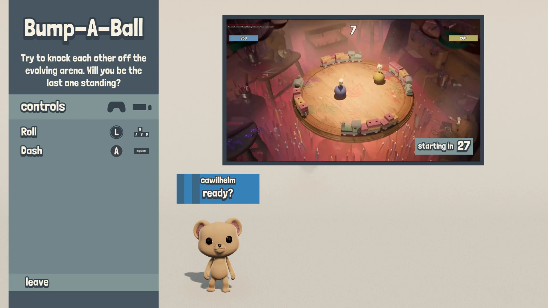
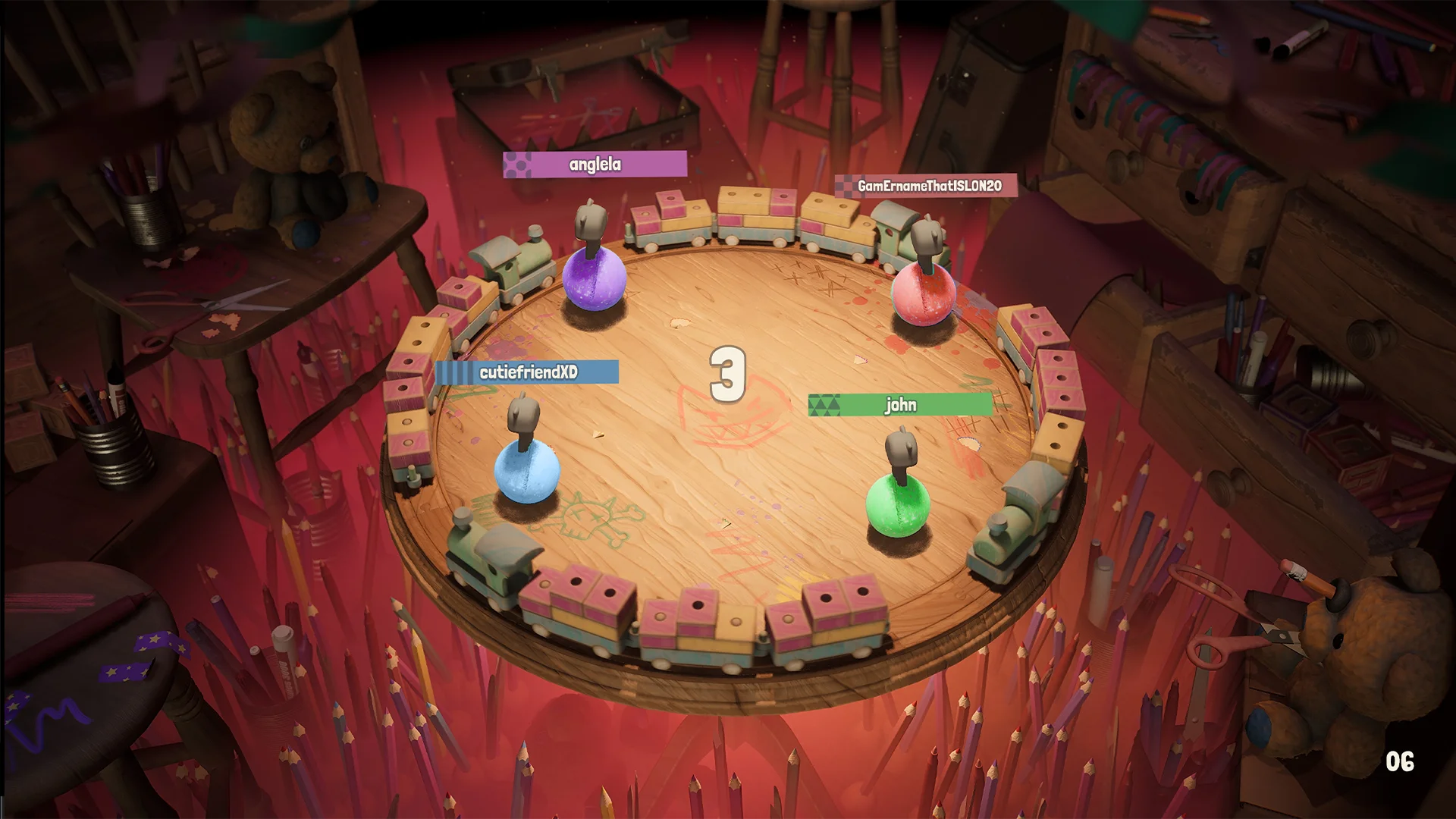
Minigame intro - In game
This screen had a lot of questions and meetings about it. Having the 3D characters show up, the explanation video. With some collaborative research, we managed to make it work.
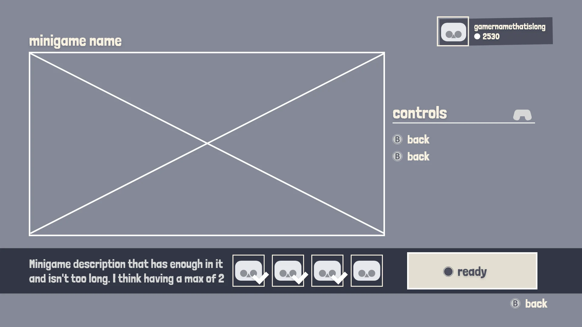
Minigame intro - UX
I wanted to make the video the biggest piece of information on the screen. Later on I had to make room for the characters and make sure the text also had enough room.
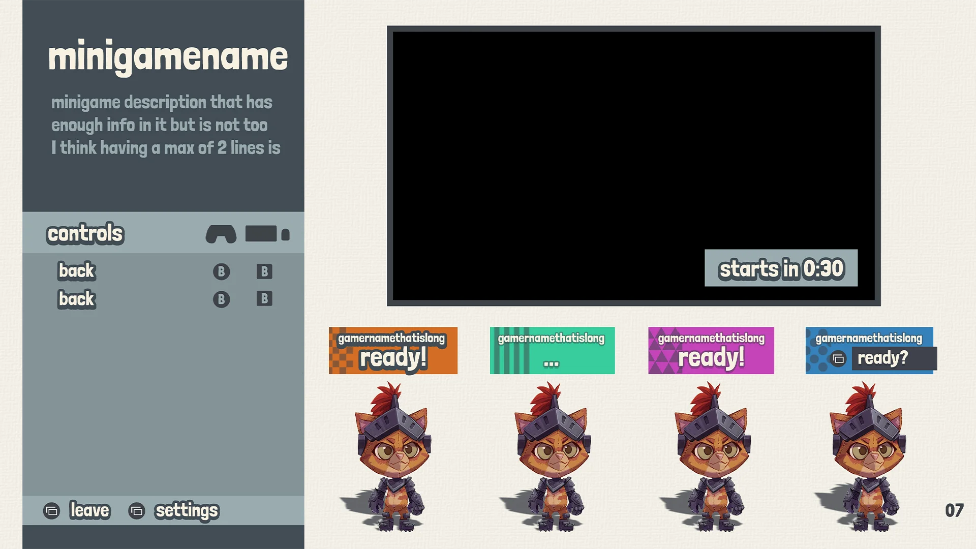
Minigame intro - Mockup
Color accessibility became a very important topic in this screen. As an extra measurement I added these symbols to the player card to help making them more identifiable.
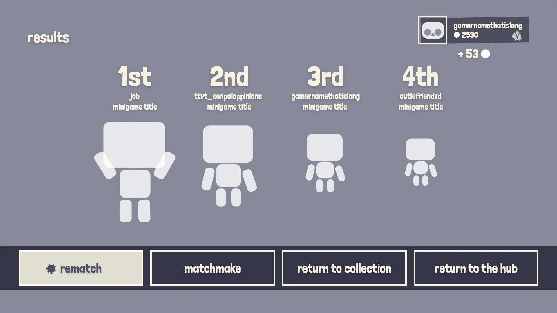
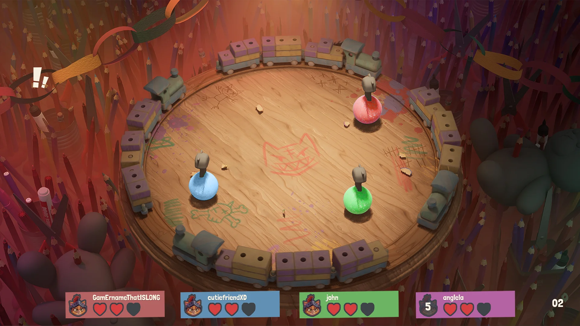
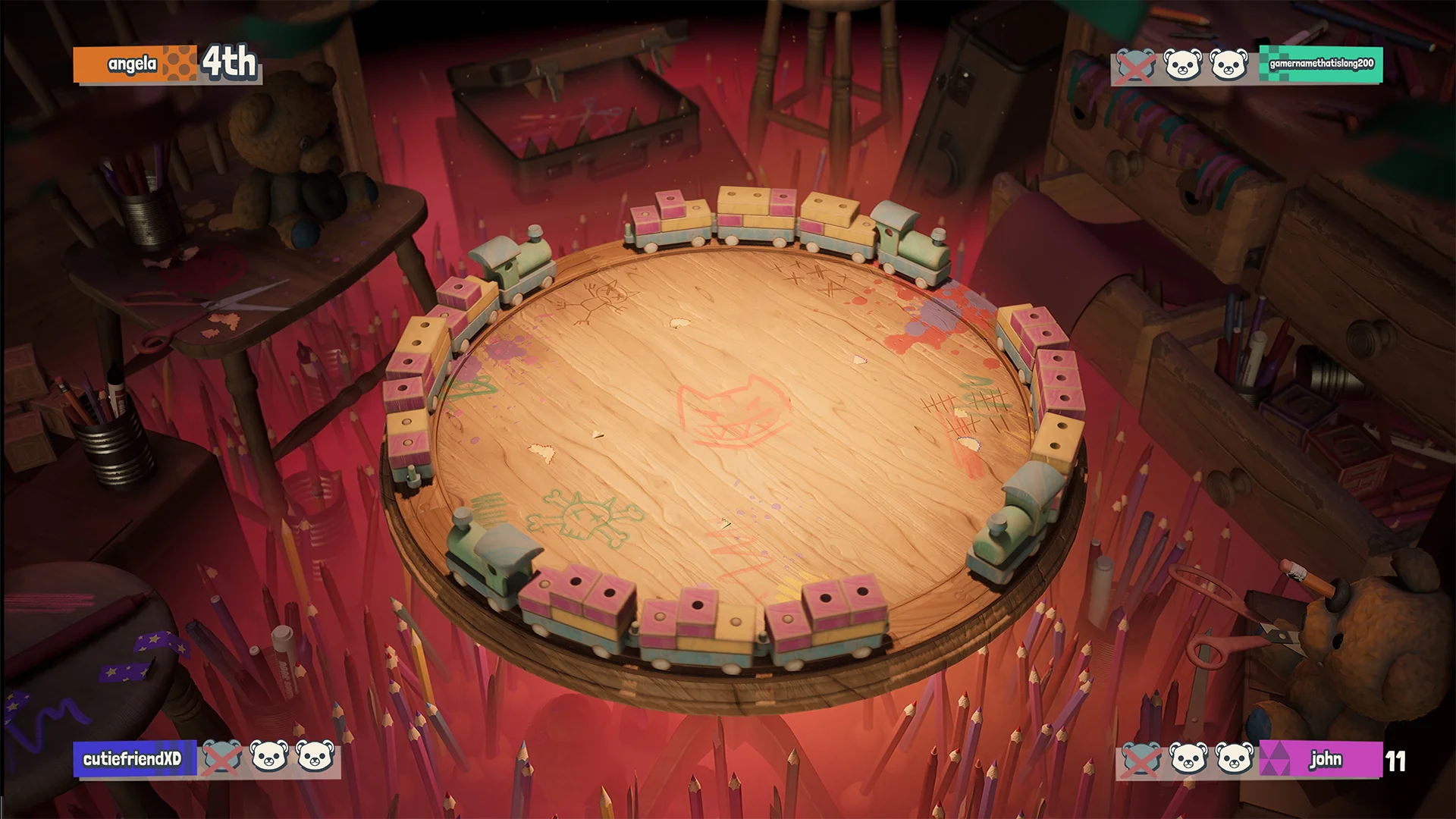
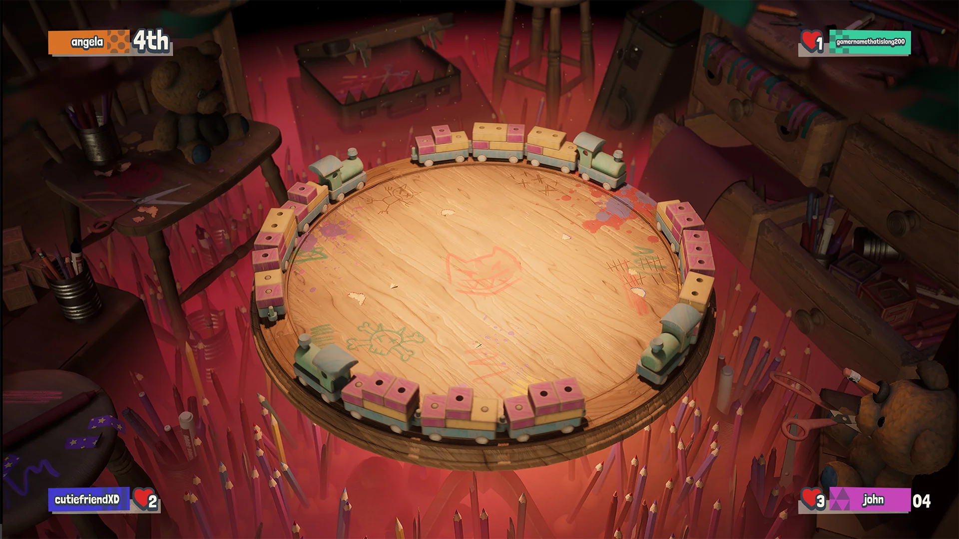
MINIGAME OUTRO
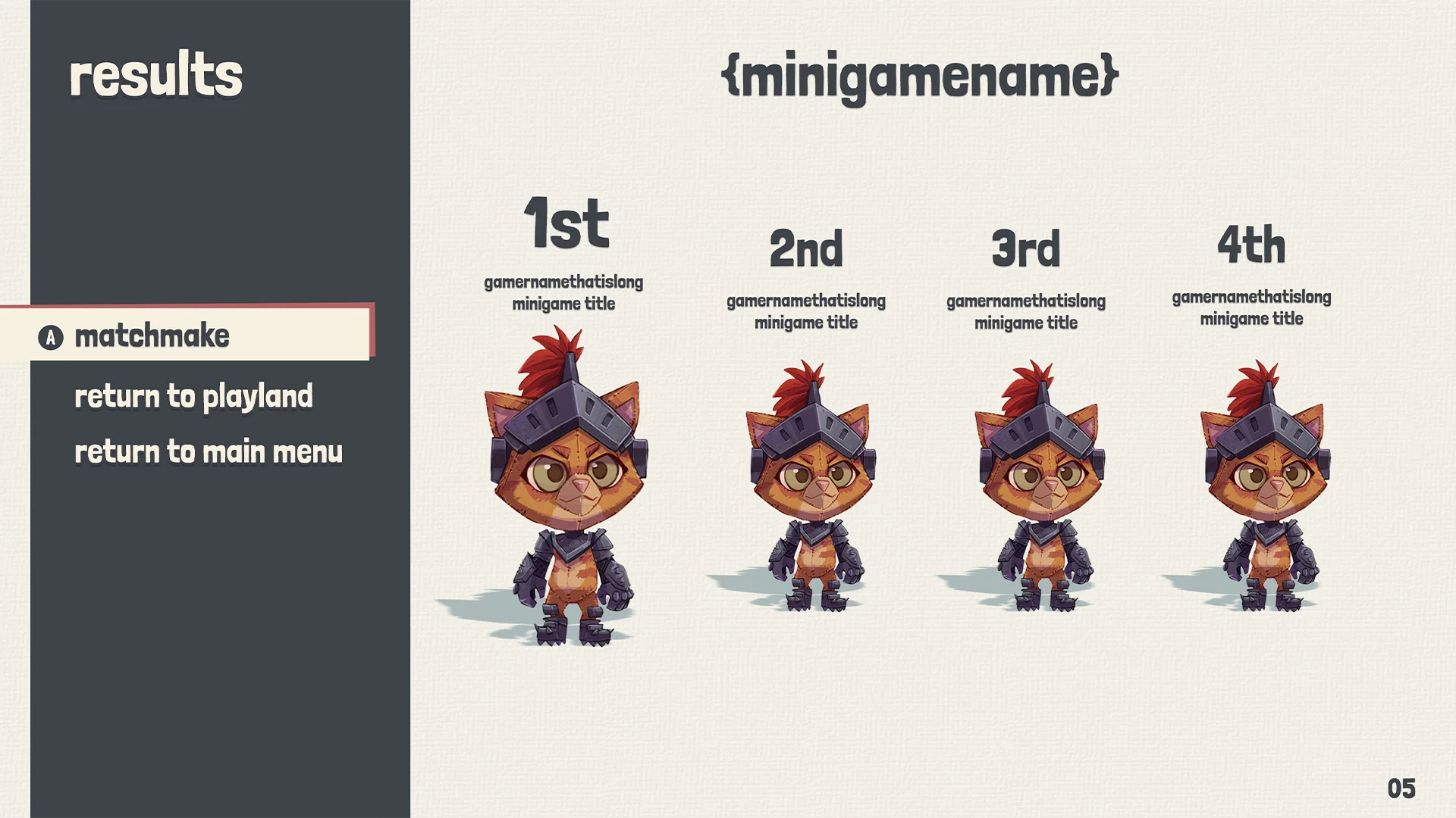
Minigame outro - Mockup
My biggest worry with this screen was the space for celebration. You want the winning character to stand out and have flares celebrating the victory of the winner.
Minigame intro - UX
I wanted to make the video the biggest piece of information on the screen. Later on I had to make room for the characters and make sure the text also had enough room.
Horizontal vs vertical
During the earlier stages I wanted to have the options be horizontal but I was worried that in the future there wouldn’t be enough space for more options. Having vertical options gives more space and is more future proof.
MINIGAME UI ELEMENTS
Minigame UI elements
I had to do a lot of explorations of these, specially the health visual. In the actual minigame making sure the information is still readable was very difficult because of all the color and noise that were in the minigame backgrounds.

Minigame UI elements iterations
Using the white border worked really well. It made sure the information was almost always visible.
Explorations
Here are some of the different explorations I have done. There are a lot of them that I liked but they would lack in a different area.
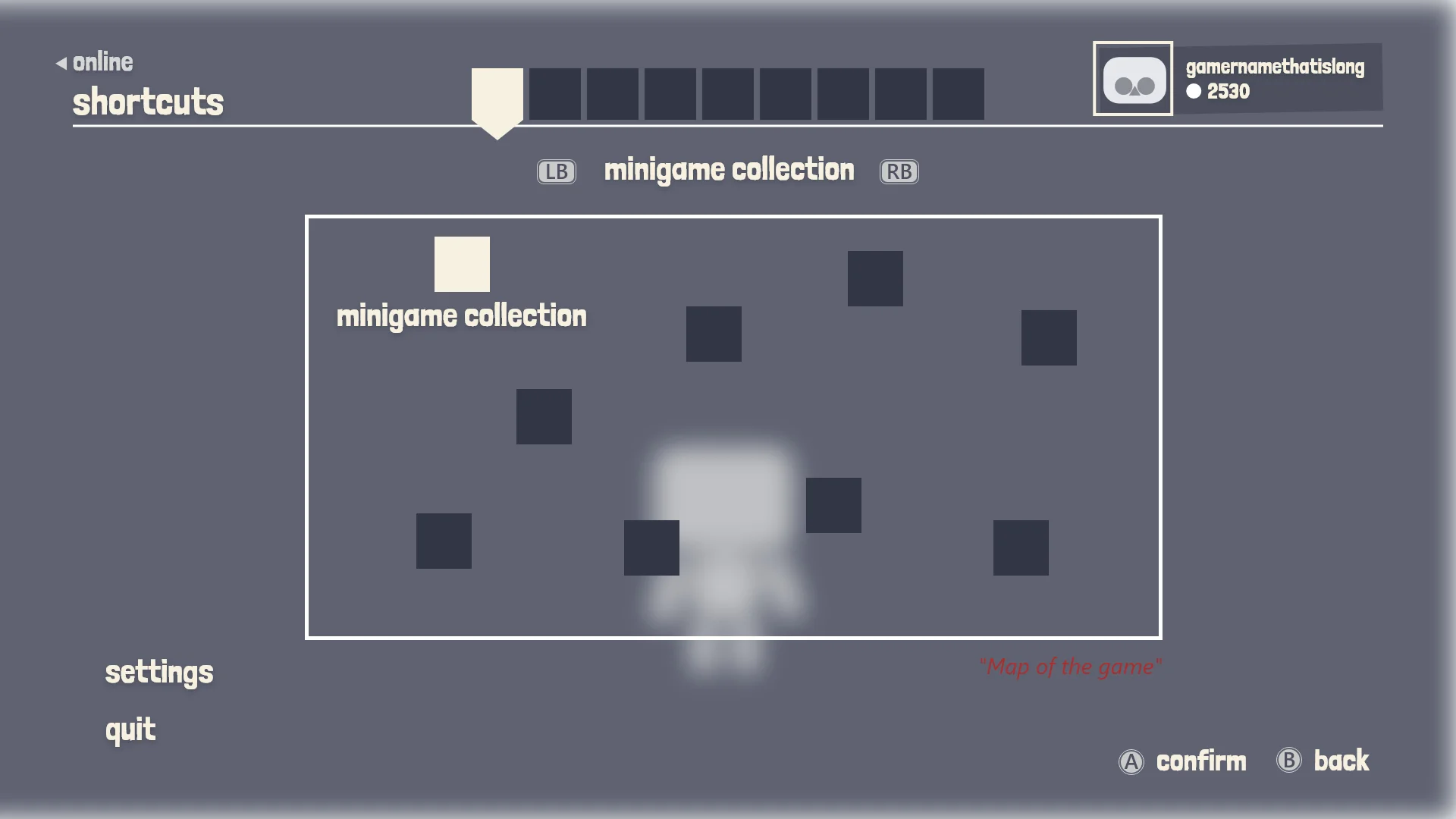
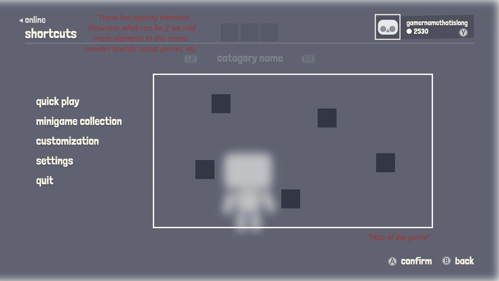
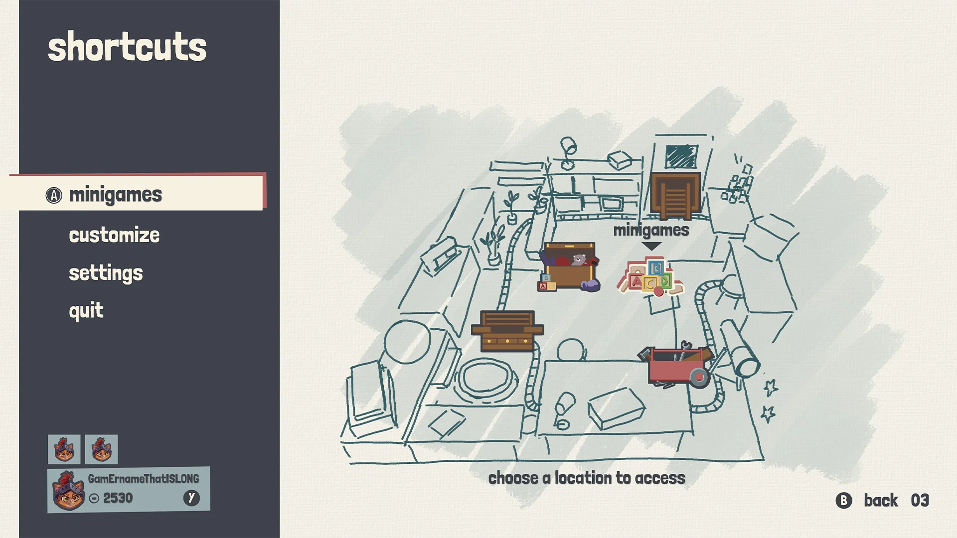
SHORTCUT
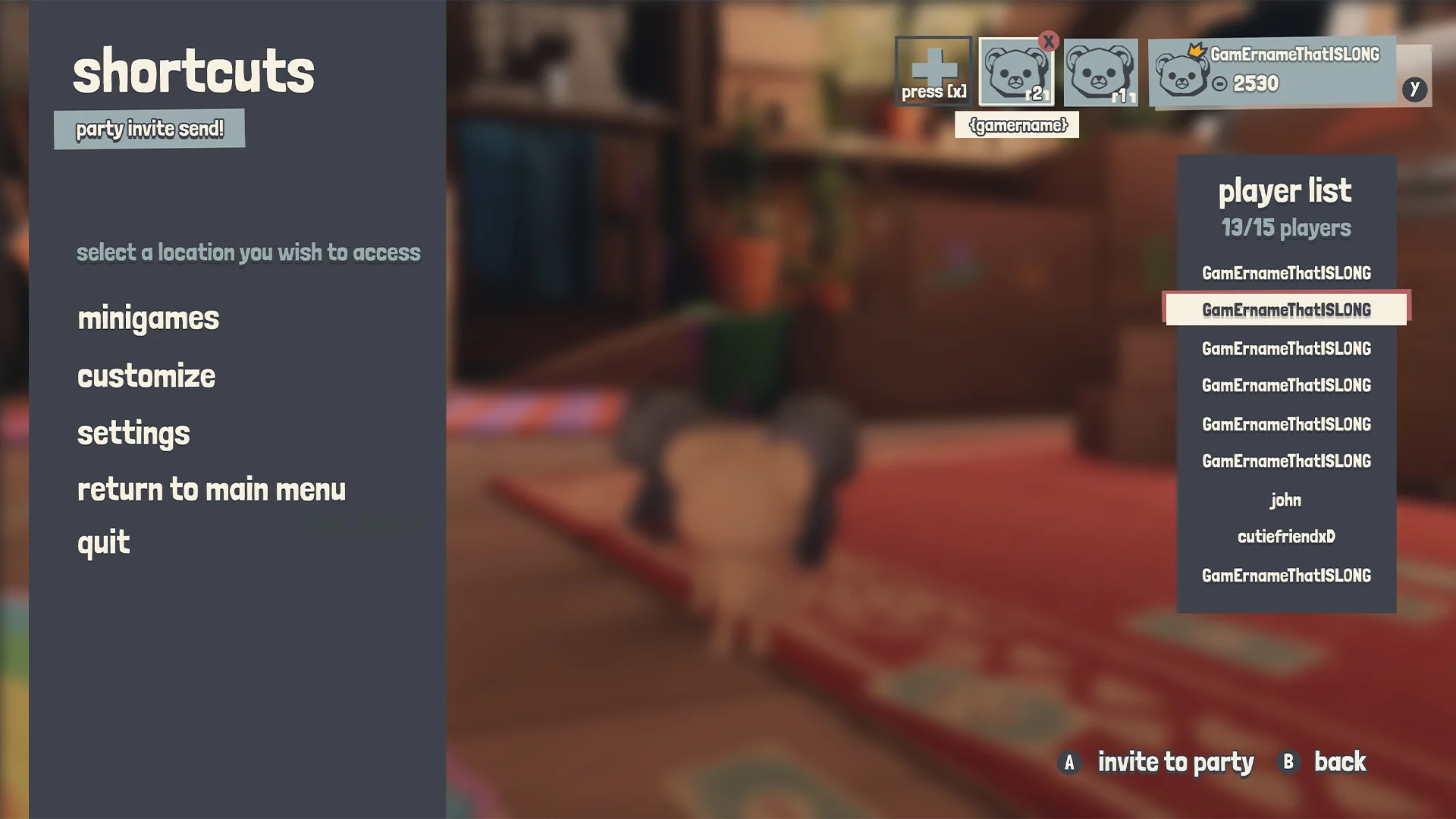
Pause menu - Shortcuts
In the playland HUB we wanted an easy way to access the menus in case the player needs quick access to them or just wants to move on. We had some more elaborate plans for this but we ended up adding them to the pause menu.
Shortcuts wireframe
The idea was to showcase a map with locations on it that the player could scroll through.
Shortcuts - Mockup
Did an early sketch of the playland HUB but we decided not to move forward with it.
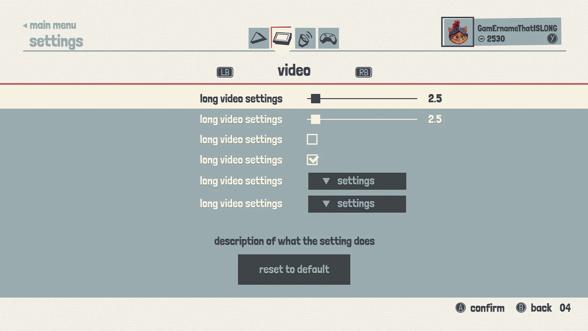
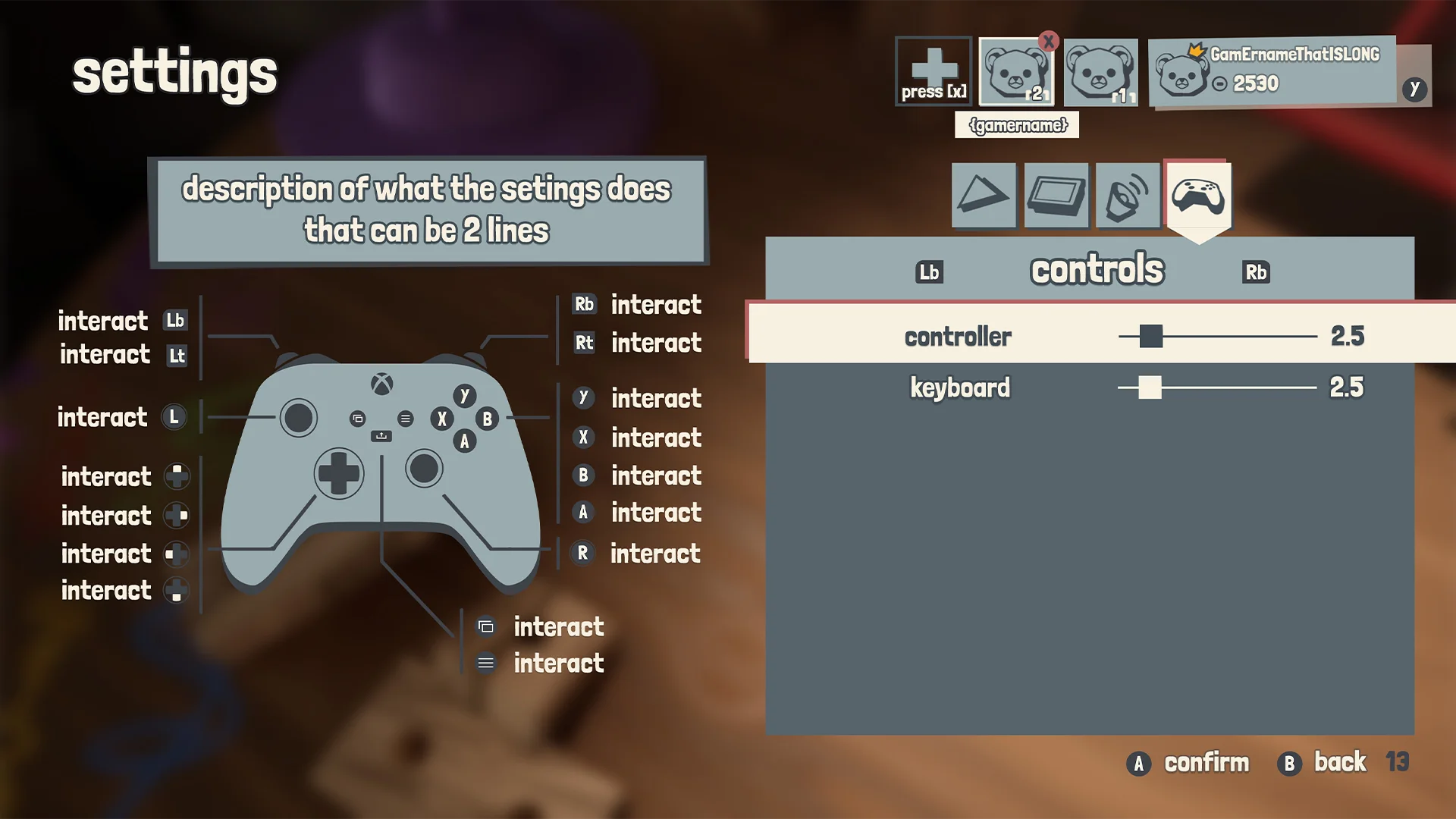
SETTINGS
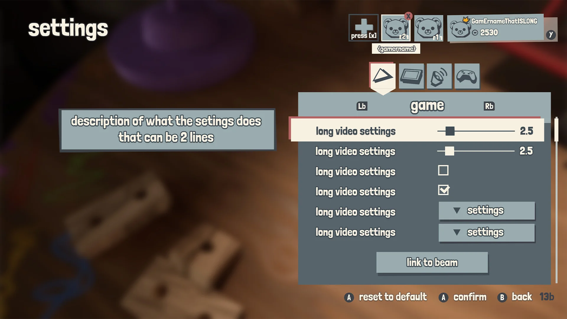
Settings menu - Mockup
In my settings mockup, I always try to include all the elements that could appear: the slider, the checkbox, the dropdown, and the standard button.
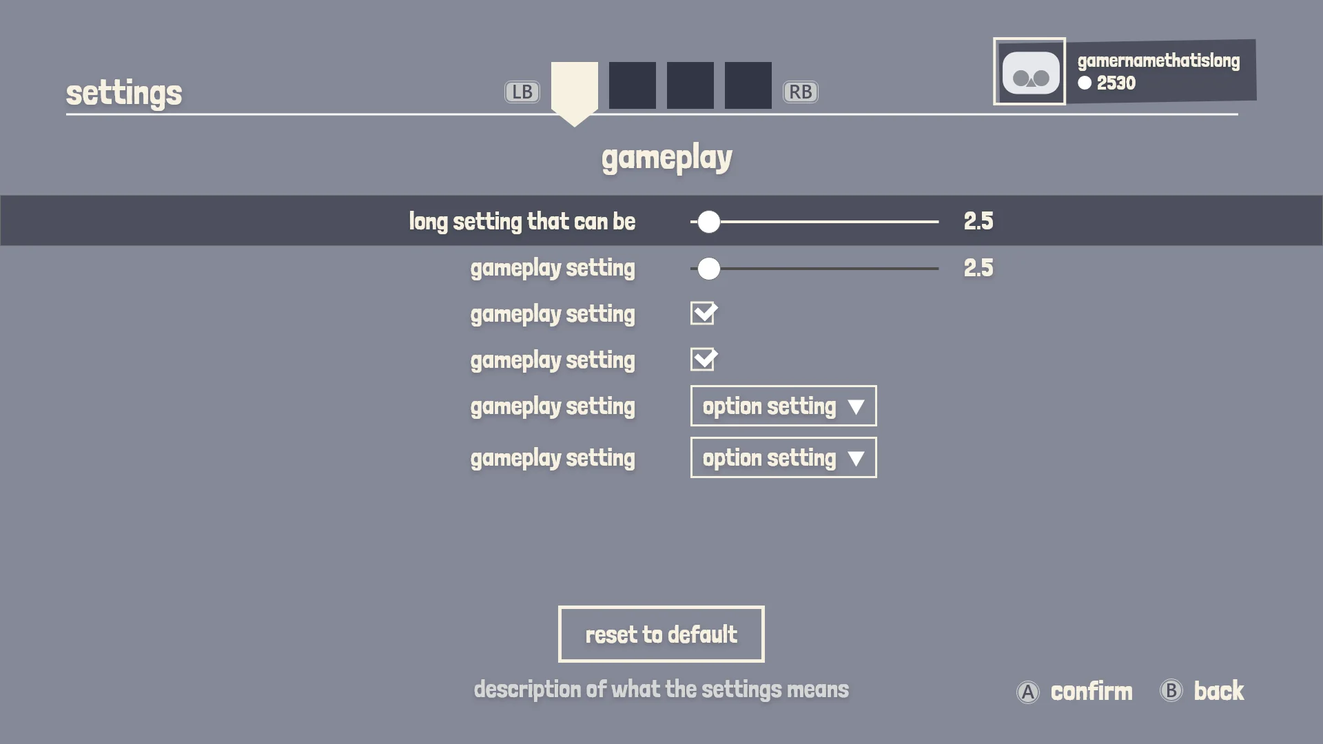
From wireframe to mockup
In the early wireframes I thought about making the settings full screen. But it seemed like a lot of screen space would be unused since we didn’t have a lot of settings for this project.
CLOSING WORDS
Learning lessons
Playland was a very educative project. I learned a lot about UX and wireframing. Working on a project where the focus was not the UI visuals was refreshing. Looking back, it makes me proud of what I achieved in a short time span.
CONTACT
Let's get in touch!


